
A Summer Sampler
Homegoods at Foltz Fine Art

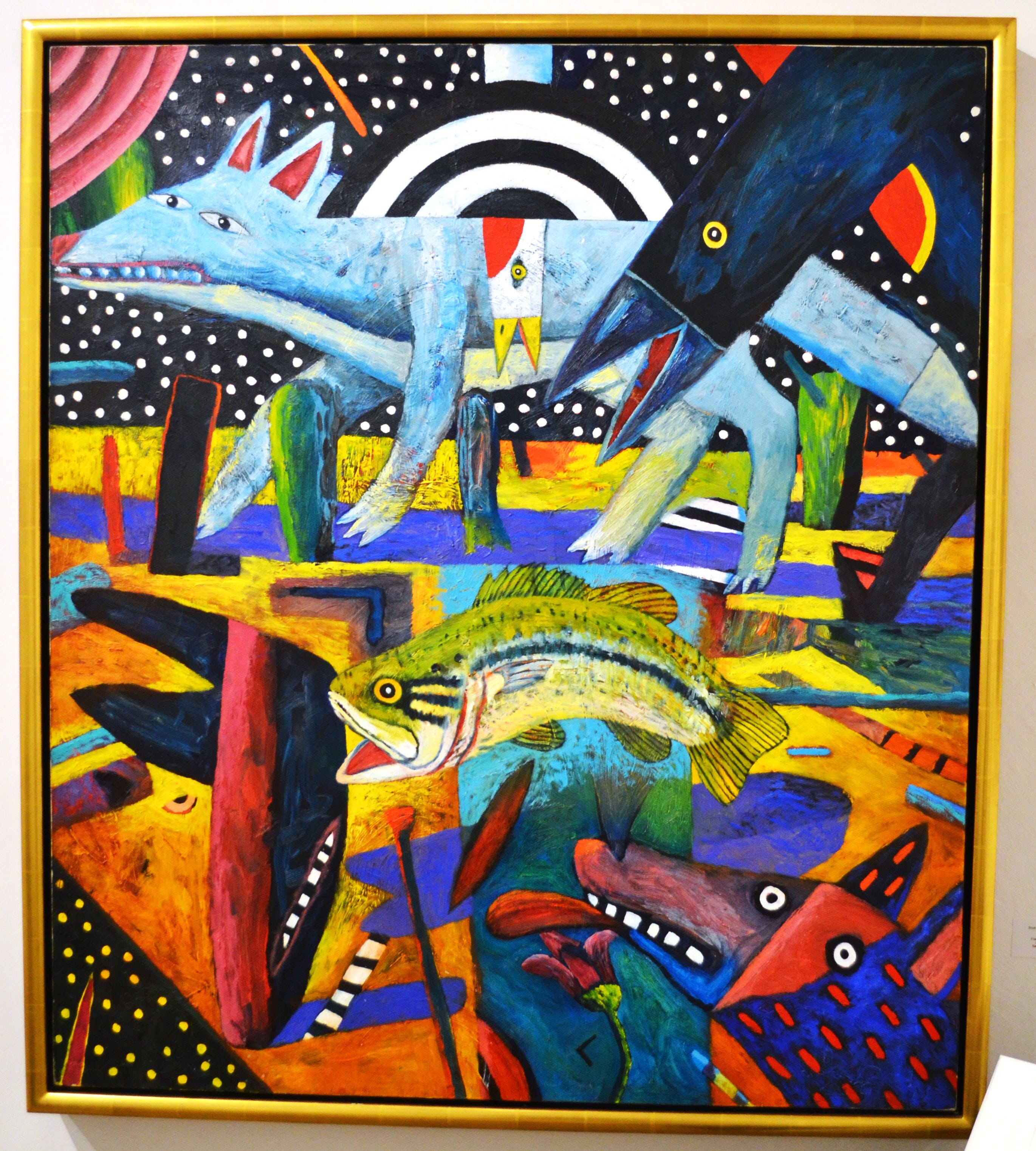
When I first became acquainted with Foltz Fine Art, their gallery was in a converted garage behind a house in Montrose. At the time it was owned by William Reaves. Sarah Foltz came in as the director in 2013 and partner in 2014. Over time, it evolved from William Reaves Fine Art to Reaves|Foltz Fine Art to Foltz Fine Art, and moved from a Montrose garage to a River Oaks storefront. My impression of the gallery was that it specialized in an earlier generation of Houston artists, which was valuable to me. It was the first place I saw work by many pioneering Houston artists.
The focus on an older generation of Texas artists is still a major part of what Foltz does, but they have been adding a sprinkling of artists who mostly started their artistic careers in this century. Homegoods is a good example of the variety of artwork shown by Foltz these days, with younger and older artists promiscuously sharing the same walls. Homegoods is a large exhibit with work by 32 artists, ranging from the Houston classicism of Richard Stout to the street-art vibe of DUAL.
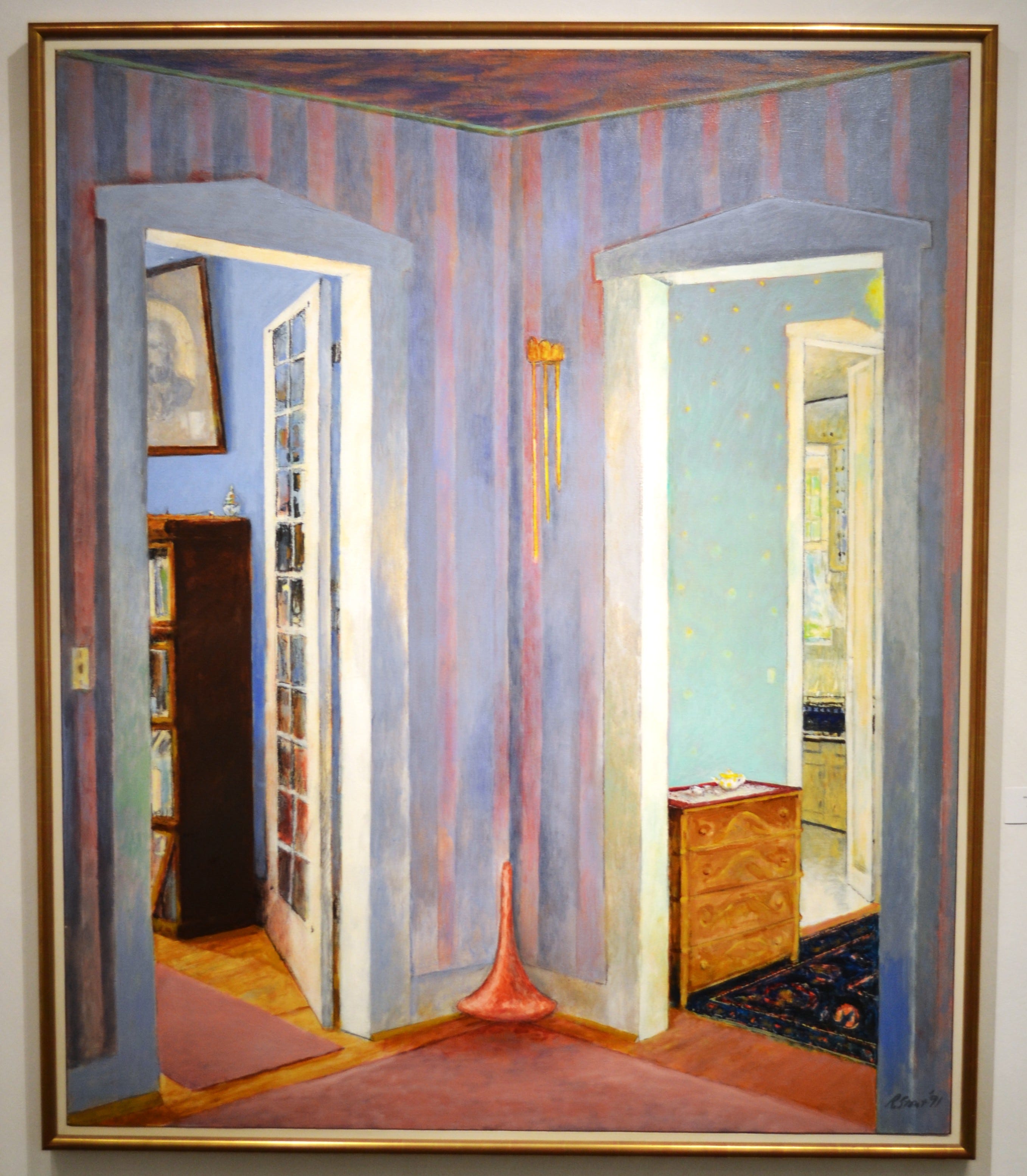
Richard Stout (1934-2020) over his career produced somewhat dreamy quasi-abstractions, so When I Was Young feels like it was a departure. The domestic setting may have affected the way Stout painted it—most of his paintings, even the most abstract, appeared to depict horizons. In a sense, Stout was a nature painter, deeply affected by the long horizons of the Gulf Coast. The pastel-colored wallpaper emphasizes the verticality of this painting. I like the way that the wood molding around the two doorways has a pale green glow. It is a nostalgic painting, associating being young and home. Even the point of view is that of a child.
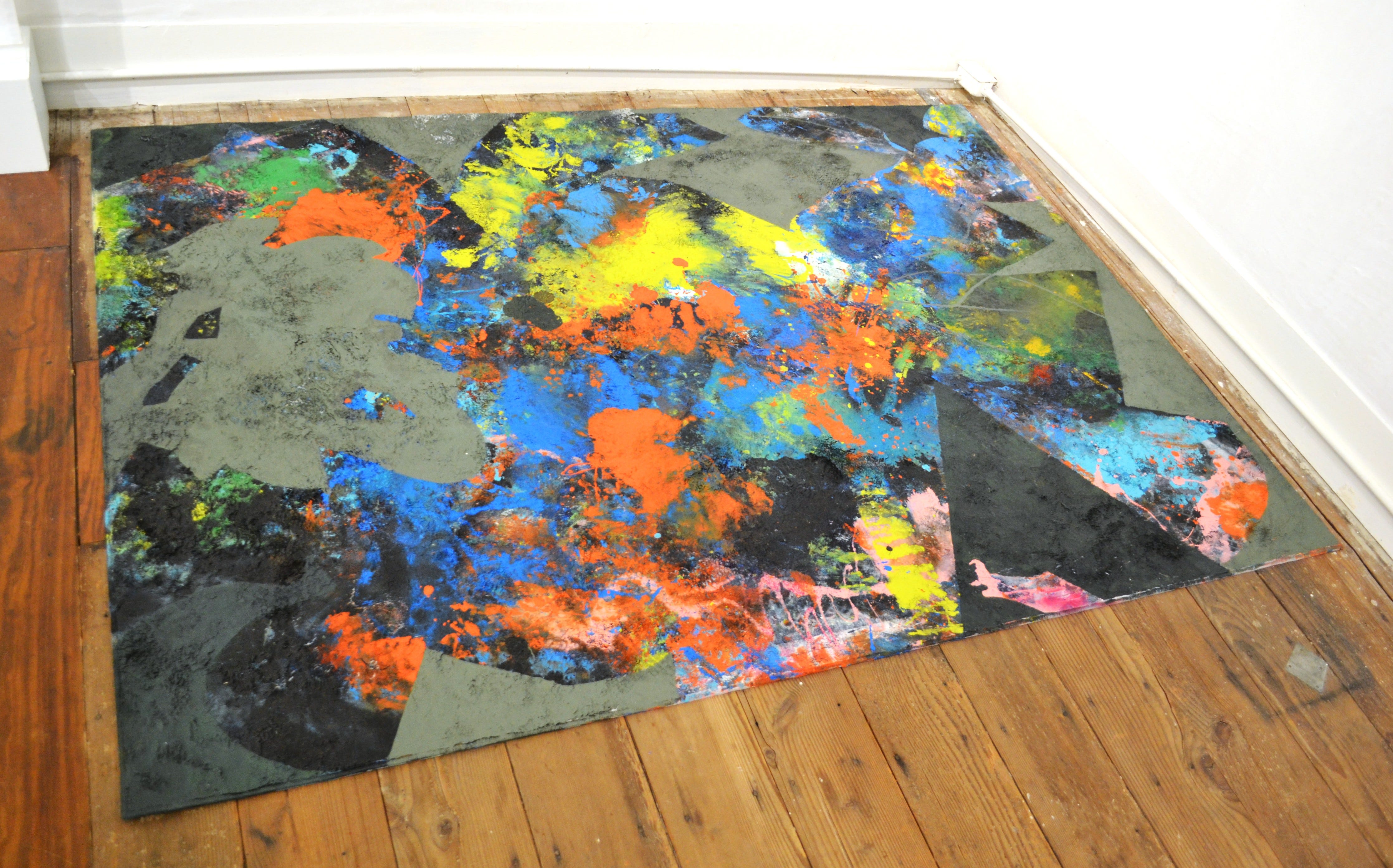
Douglas Welch and Mitchell Pengra are two artist/roommates who had never officially collaborated on a piece before. To produce Beyond Aquariance, they made impressions with their bodies on the rug, producing a chaotic abstract composition. There are also stencils of found household objects. The blue, yellow, orange, and green splotches pop out from the composition, contrasting with the more geometric black and pale olive green areas. Welch curated a powerful exhibit at the Blaffer Gallery last fall called A Way to Mend which included photos of some of Pengra’s performance practice, which involves coating his body with mud and paint. Given this, Beyond Aquariance seems like a natural outgrowth of Pengra’s already established body of work.


It feels to me like Michael Tracy shared some of the same artistic concerns that Welch and Pengra do—his works were less about producing objects, and more about shamanic practices to heal the world. 14 Stations of the Cross is a grungy but beautiful work, with 14 house-shaped objects coated with a thick, lumpy, brown stuff (the label simply says “mixed media”). The 14 stations of the cross is a series of 14 images depicting episodes from Christ’s walk from the Lion’s Gate to Calvary hill, where he was crucified. His journey has been depicted in Catholic (and Episcopal) artwork for centuries. Tracy honors that history. Tracy died last year.
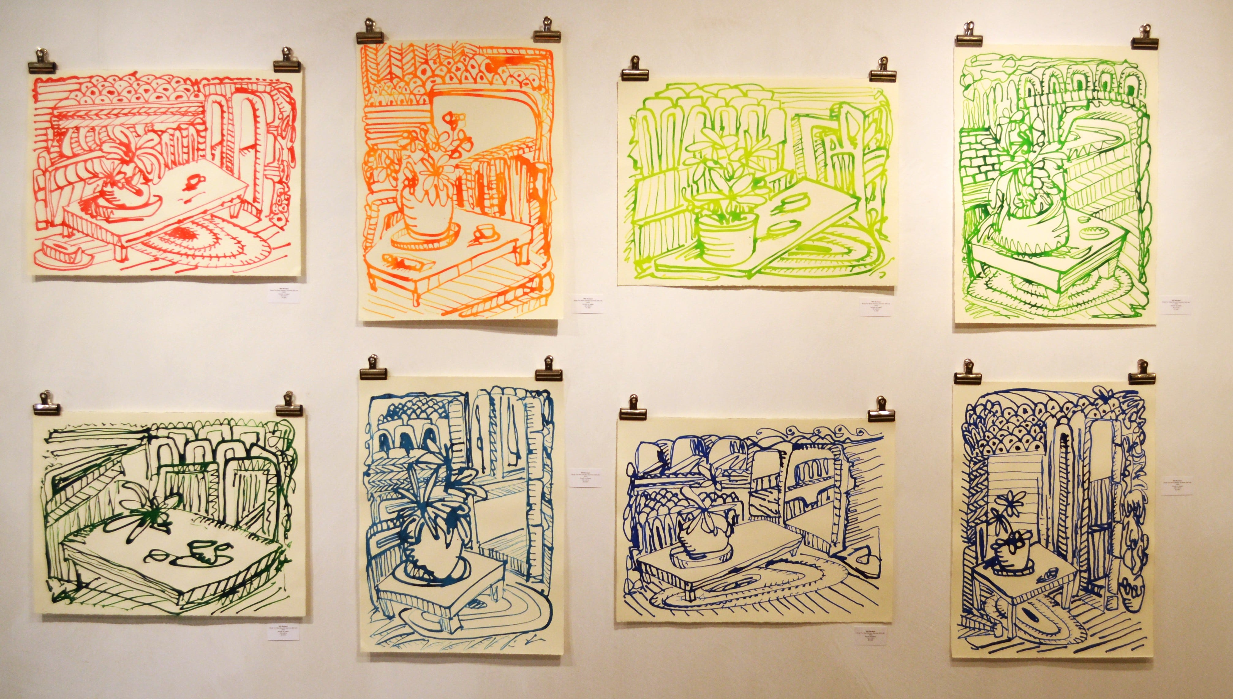
Will Bentsen is a painter who is best known to me for being a member of the very loose artist collective I Love You Baby with Paul Kremer, Rodney Chinelliot, Chris Olivier, and Dale Stewart, about whom I wrote an appreciative retrospective article in Glasstire. He is a much calmer artist now in the years since I Love You Baby broke up in 2008, producing sunny gestural abstractions. These drawing are not like his abstract paintings except they leave a lot of the painting surface blank and they reflect a sunny visual vocabulary. The Study for Best Generic Summer Still Life pieces are beautiful while simultaneously making fun of bourgeois art tastes. It is a much quieter version of the work he was producing with I Love You Baby; it has a satirical bite underneath—it’s radical artwork that you could give to your mom.
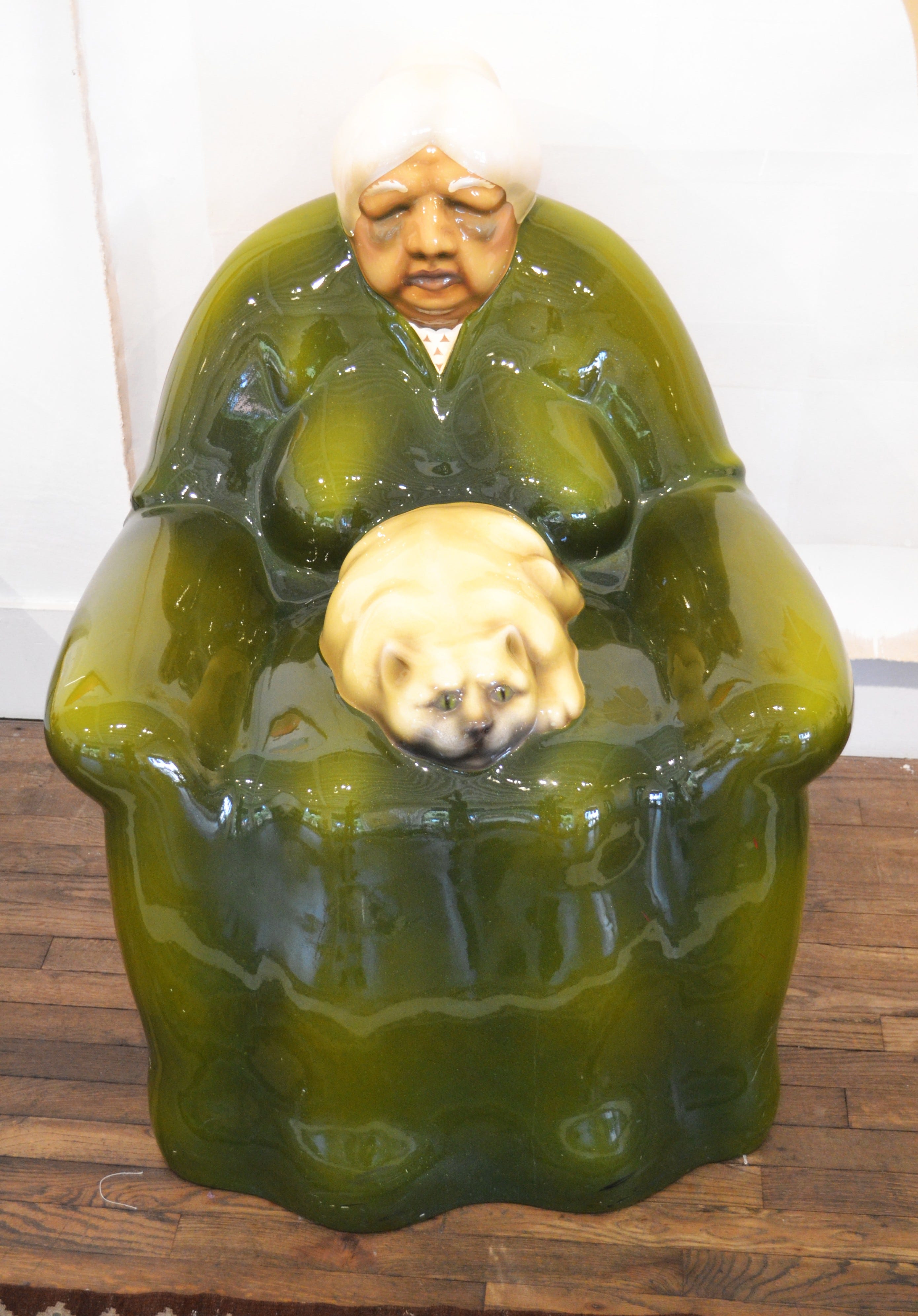
Luis Jimenez was an El Paso-based artist who died in 2006 following an accident when part of a sculpture fell on him. If you fly into Denver International Airport, you can see the sculpture that killed him—Blue Mustang, or as it is known locally, Blucifer. His pop sculptures often reflected his Mexican-American background, and this one is no different. The green chair was one he used in his studio, and the woman is based on his own grandmother. His grandmother never owned a cat, but he added one in to accentuate the old woman’s immobility. The old woman seems part of the chair, so much so that when I walked up to it initially, I thought it was a chair. I almost sat on it.


Matt Messinger is one of my favorite Houston artists—I am looking at his painting Fuse Box hanging on my wall right now. These two sharp-edged still lifes are a pretty radical departure from his earlier work, which felt a little more hand-made than these sleek productions do. Both feature brightly colored silhouettes of bottles existing in perfect platonically ideal versions of a countertop or a vanity. The bold airbrushed shapes have a mysterious presence while exhibiting poster-like colors.
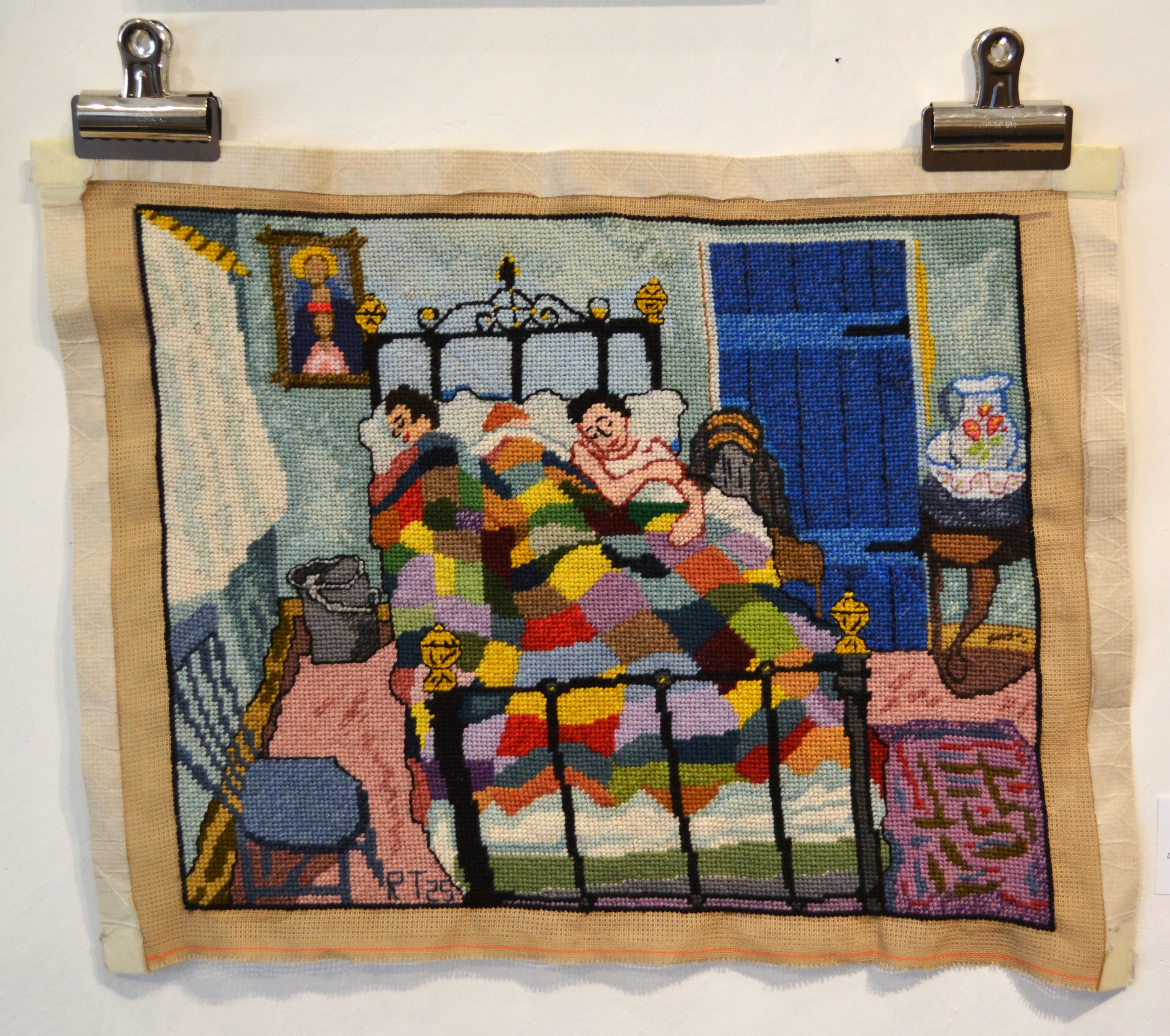
Randy Tibbits is best known to me as a scholar and keeper of memory about Houston’s earliest art scene. He was one of the curators of The Fabulous Fifties: Houston Art at the Dawn of the Space Age, 1945-1961 at the Julia Ideson building at the downtown Houston Public Library last fall. In addition to being a curator, art collector, and writer, he does these very involved needlepoints often based on paintings by other artists. Gerard Dillon was a gay Irish artist who died in 1971. Tibbits wrote about his discovery of Dillon in this post from his substack, Recollections, Reflections, Fantasies, Fictions. He says that he discovered and vibed with Dillon’s work before learning Dillon had been gay. He was mainly drawn to the playful colors and shabby milieu of Dillon’s settings.


James Surls is one of Houston’s most beloved artistic figures. I vividly remember seeing a James Surls sculpture for the first time back in the 1980s—I Am Building with the Axe, the Knife, and the Needle's Eye. I fell in love then, and I have loved his art ever since. He is a powerful sculptor and would be proud to be called a woodworker. His sculptures typically have a monumental presence, so the domesticity of Cutting Block is something unexpected from him. The warm coloring of the wood somehow makes it feel even homier. The little house on the cutting board reinforces the domestic feeling.
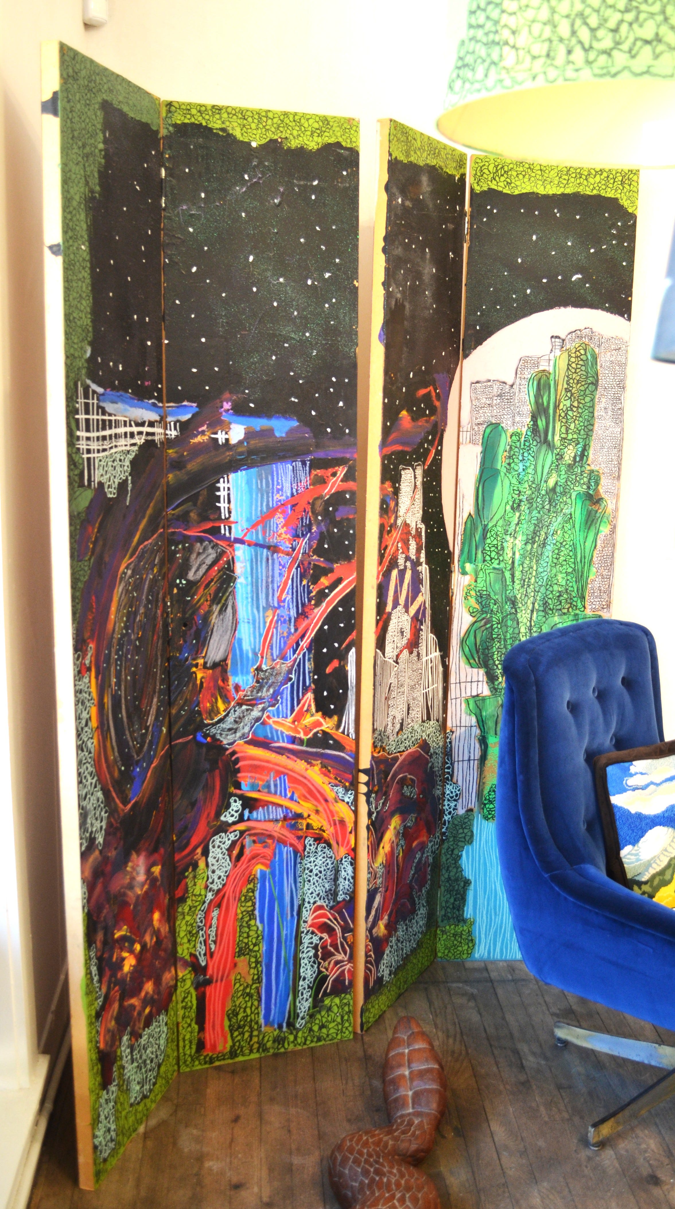
The domesticity of Cutting Block is somewhat matched in this piece by Jonathan Paul Jackson which makes me think of a dressing room screen. A Snail Makes Its Move in the Pink Moonlight is surreal nighttime landscape, with a large waterfall in the second panel emerging from the green wooded darkness. Jackson works with rough slabs of color over which he adds green or white scribbles that give the flat areas of color a texture. It’s a kind of spooky image, although the nighttime setting has something to do with that.
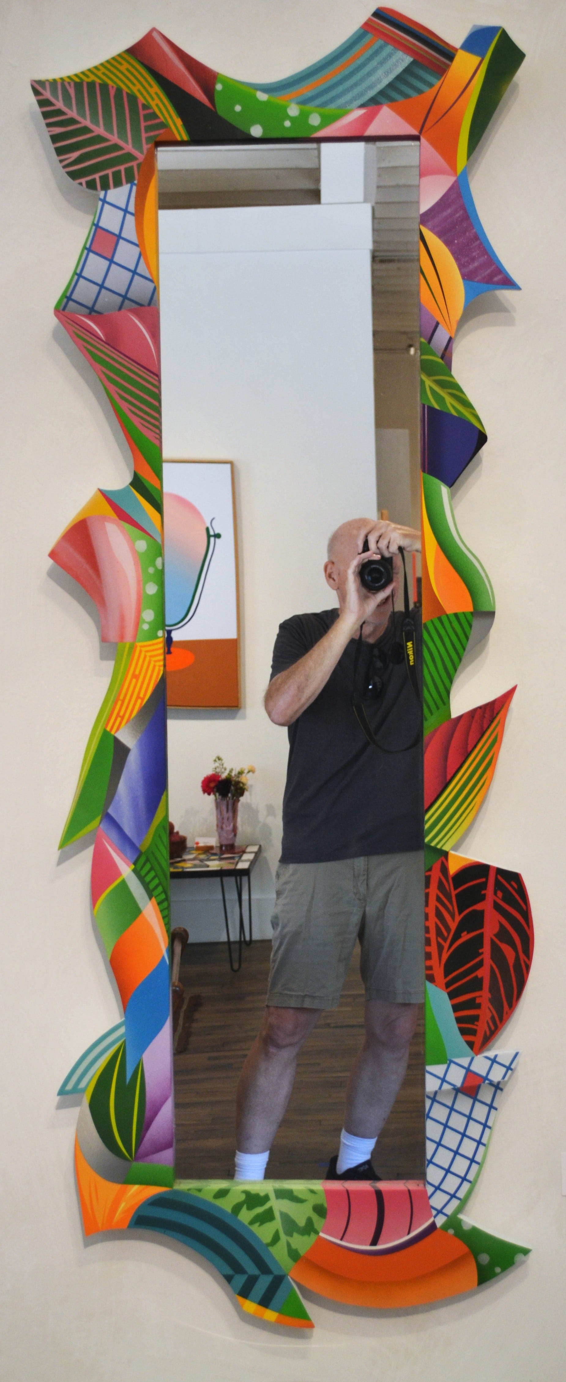
Continuing the theme of domesticity that pervades Homegoods (what with its throw rugs, cutting boards, dressing screens, etc.), DUAL is displaying something that every home has—a full-length mirror. DUAL got his start as a graffiti artist—I recall seeing pieces he did on abandoned buildings in my neighborhood. When he started having gallery shows, I was impressed. He had taken an inherently somewhat messy paint medium (spray paint), and has somehow created these hard edge paintings with stylized tropical vegetation. His jungle-style paintings were on display at a massive exhibit he had at Reeves in 2022, A Trip Thru the Jungle. In Edge Theory, there are many leaves, maintaining DUAL’s obsession with the jungle, but also obviously man-made designs—grids, parallel lines, and so forth. Like most of his recent work, Edge Theory is crisp and lively. Dressing in front of this mirror in the morning, one would have no idea of DUAL’s street art origins.
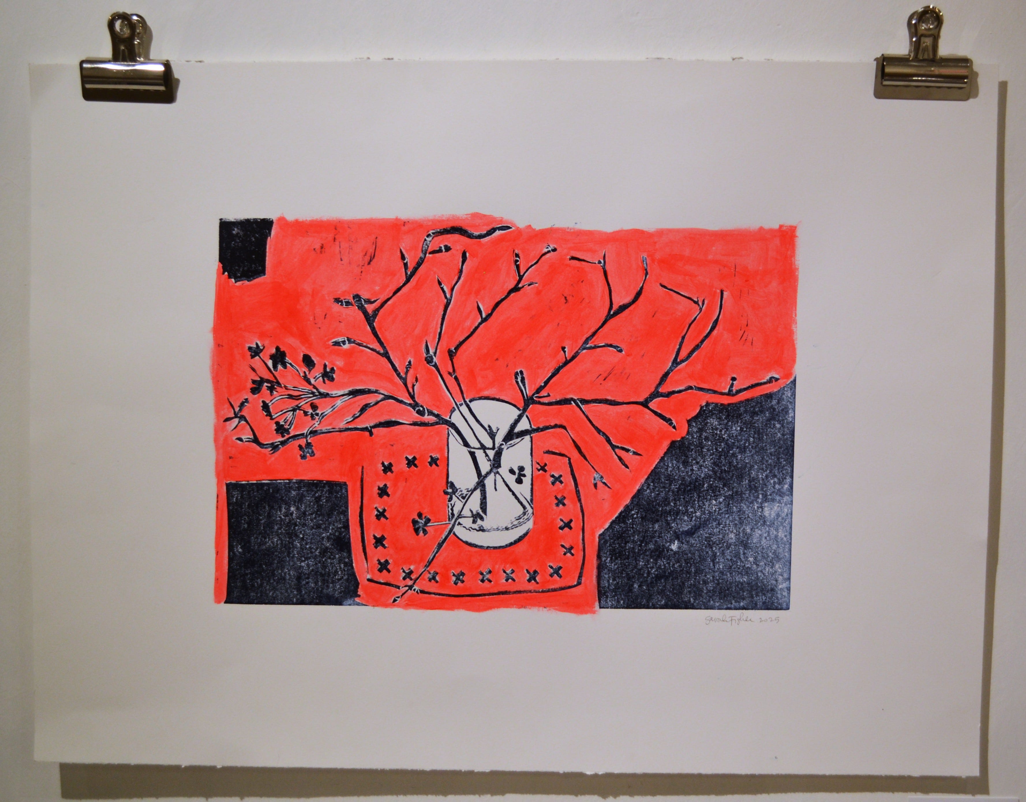
Sarah Fisher’s Still Life, like those by Wil Bentsen, are atypical of the work I’ve come to expect from Fisher. She is best known to me for her powerful, Catholicism-inflected portraits of persons murdered by ICE. Her art has been seen on protest signs at anti-ICE demonstrations. But even revolutionaries can enjoy a pleasing still life. Still Life seems like an especially apt subject to include in Homegoods. The glass being used as a vase against the flat red background made me think of Matisse’s The Dessert: Harmony in Red, a classic tribute to domestic virtues. I doubt if it is a conscious tribute—their similarity is probably coincidental. The fact that it reminded me of Matisse is to its credit as being likewise a very pretty depiction of small domestic pleasures.
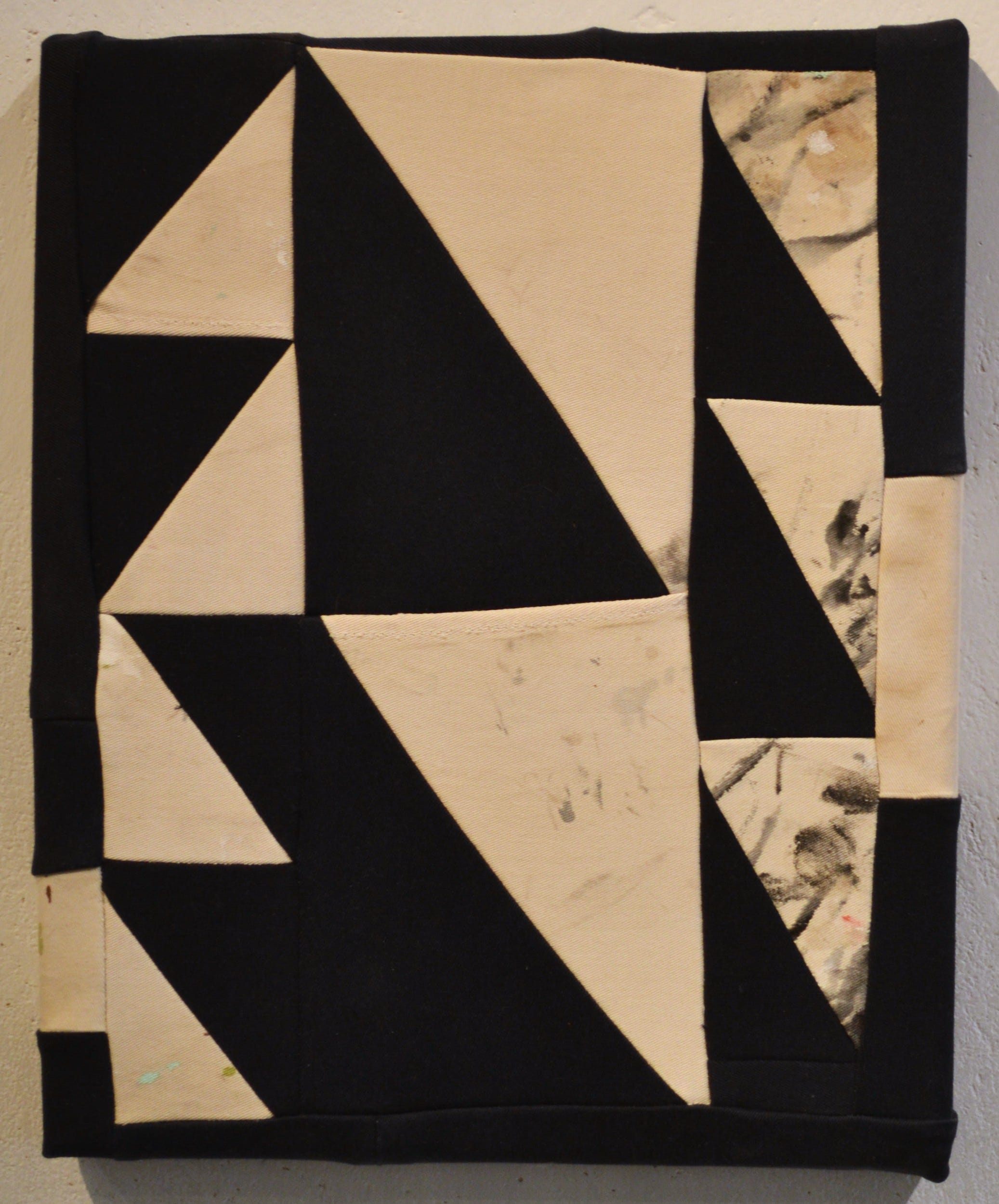
Christopher Cascio’s body of work involving repurposing old clothes quilted into tiny abstractions is a few years old. On Work Pants Triangle, the pieces of fabric are one color, but on other pieces in this series, he also included fabrics with words or patterns on it. (His most recent work is very different—hop over to Basket Books to see his intense installation, Culture Club.) His tiny quilts, like Tibbits’ needlepoints, refer to domesticity in way different than DUAL, Bentsen, or Stout. Tibbits and Cascio’s domesticity is of the sort one expects from women as in Old Woman in Chair. Quilts and needlepoint are the kind of art that doesn’t get respect, perhaps because of the sexism of art tastemakers. Cascio’s quilt is far from cozy, however—the jagged black and off-white design feels like classic geometric abstraction.
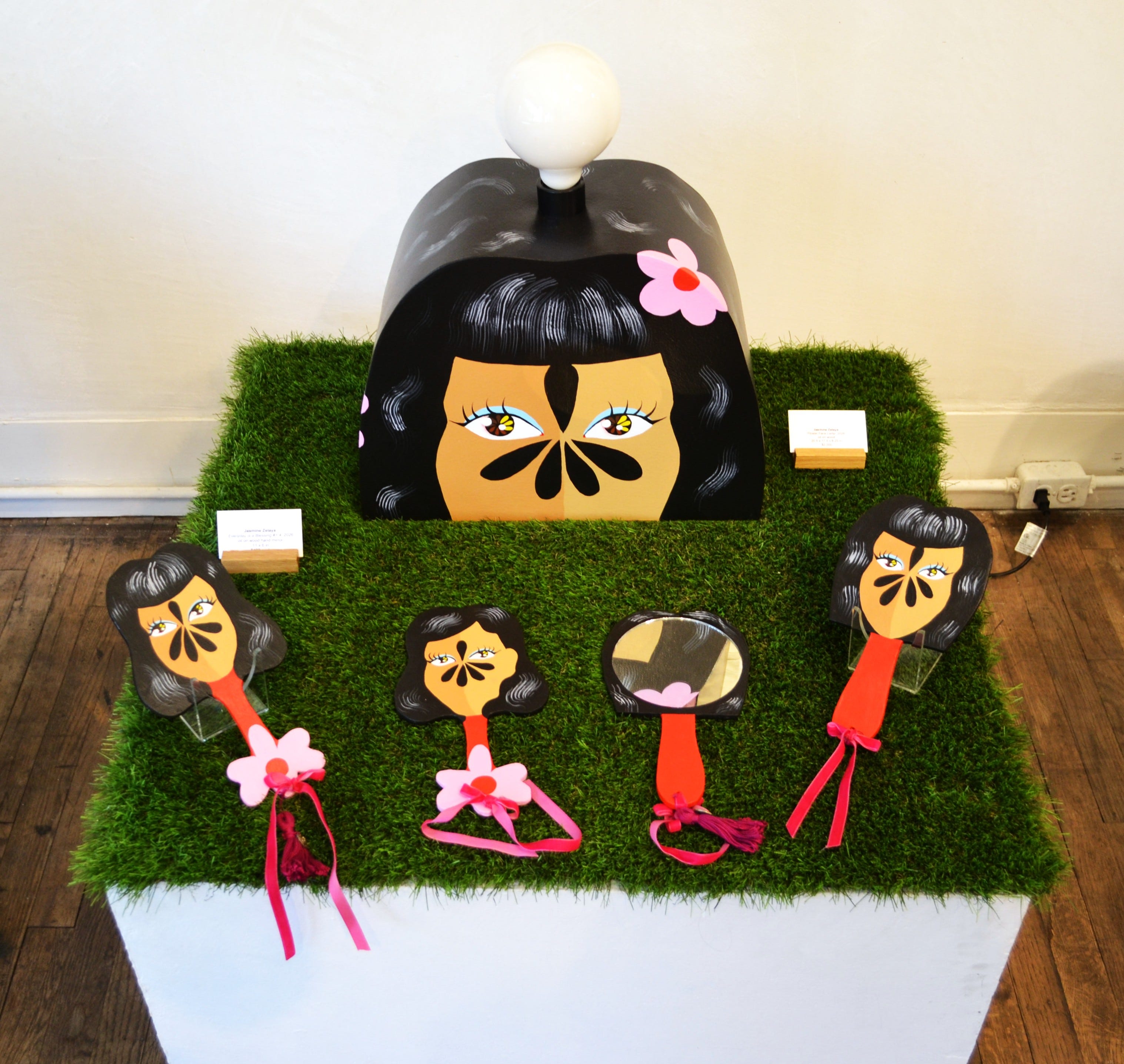
Jasmine Zelaya is an artist I was not familiar with, although I’ve seen her flower faces before here and there. Zelaya’s work, like Fisher’s, is often quite political, but this flower faced vanity table manages to fit the overall domestic theme of Homegoods very well. The girly theme of Flower Face Lamp is enormously appealing. Not all of Zelaya’s women are so girly—her Homegirls is a series of portraits of tough Hispanic women straight out of Love & Rockets. But Flower Face Lamp has a different vibe—I imagine a vanity in a teenage girl’s bedroom when I look at it.


Domesticity is doubled down on in Cary Reeder’s pastel house paintings. Her current work are mostly abstractions based on natural shapes, but the house paintings were the type of work she was doing when I first saw her artwork. I was delighted to be able to see some again, especially the majestic Doublewide - Diptych, which Fotlz creatively displayed so that the piece wraps around the corner of the room. (It was displayed right above Beyond Aquariance.) Reeder takes a wooden clapboard houses and strips out every extraneous detail. Just as Messinger has created platonic still lifes, Reeder’s houses are less houses than platonic idealizations of a house. The pastels give them a somewhat coastal vibe.


When I was a high school student taking after-school painting lessons from Stella Sullivan (1924-2017), she was producing a series of realistic paintings of Houston houses that she called “house portraits.” But she also was producing stylized word artworks (like Robert) as well. Her playful, cubist inspired pieces here recall her work from in quasi-cubist paintings from the 50s and 60s, two of which Randy Tibbits included in The Fabulous Fifties: Houston Art at the Dawn of the Space Age, 1945-1961. Her Summer Houses differ from Stout’s or Reeder’s, but have the same sunny, optimistic feel. (I bought Robert for my personal collection. If Foltz had a similar silkscreen that read “Pan,” I would have gotten it instead.)
Homegoods is an ideal summer smorgasbord. I can’t express how much of a relief it is to write a review that requires nothing more from me that to look at some artworks and think about them—especially art as comforting as the pieces in Homegoods. Given the upsetting nature of my last post, which involved actual reporting of horrific crimes, this is a palette cleanser. It was good to write it before diving into more Epstein horrors.
Furthermore, I am of the opinion that for the good of America, Jeffrey Epstein’s best friend Donald Trump must release everything related to the Epstein case (unredacted), disband ICE, and resign.
[Please consider supporting this publication by subscribing, by becoming a patron, or you can also support it by patronizing our online store.]
Thank you so much for mentioning my work, Robert. Proud to be in such a beautiful show at Foltz!
Nice review Robert, thanks!