Gathering Civilization's Cast-offs for Art
A small exhibit by Sunni Forcier, John Mark Sager, and Ward Sanders
I was visiting galleries last weekend and stopped by Hooks-Epstein to see the exhibition of prints by Stephanie Mercado, which I greatly enjoyed, but that’s not what I’m writing about here. I want to discuss a small group show in the back of the gallery called Gatherings, featuring three artists who use found objects to create small sculptural assemblages. The artists in Gatherings are Sunni Forcier, John Mark Sager, and Ward Sanders. I’m quite familiar with Sanders (I own two pieces made by him) and have encountered Forcier’s work, but wasn’t familiar with Sagar’s work. The three artists each have their own approach to assemblage, but they make sense exhibited together. A group show can be a dialectic between contrasting works that leads the viewer to a new way of thinking, or it can be works that approach the same subject matter in subtly different ways. This exhibit belongs in the second category.
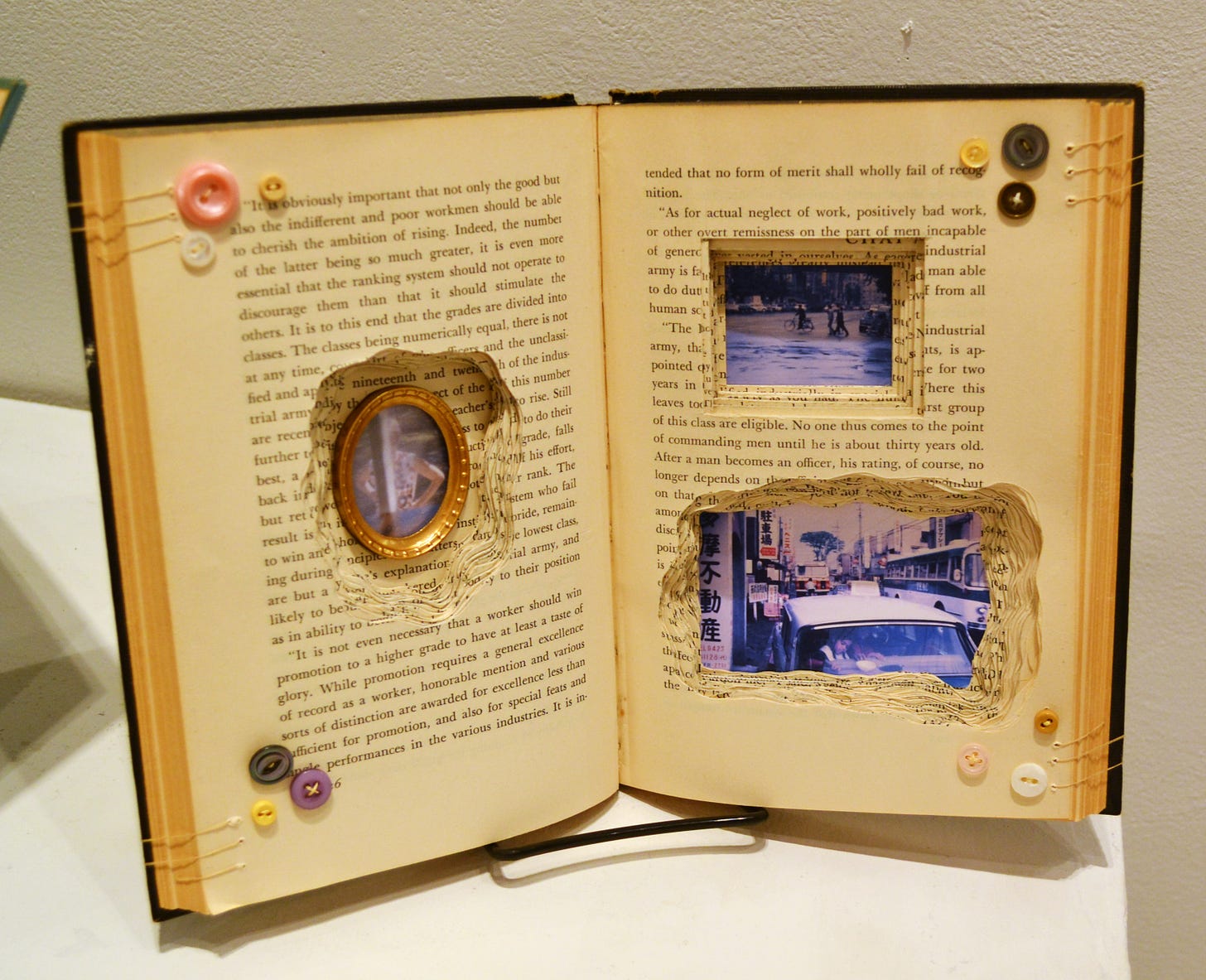
Sunni Forcier’s works here use books as physical objects (as opposed to literary material) as her raw material. Her books are displayed standing up, open to a page, and then modified. The modifications include carving holes into the books (which sometimes show printed words from other pages, but sometimes have non-literary things in them, like photographs), items attached to the open page (including photos and buttons and other printed material), and thread (Forcier sews the pages so that the book opens one a certain page spread). The titles of her pieces are the titles of the books she uses as their physical basis. In “Looking Backward” (named after Edward Bellamy’s utopian novel of the same name), she has carved deep holes in the pages and placed what appear to be snapshots in them. Perhaps they are personal photos, or maybe they are ones she found in the wild. But the quality of the color in the photos makes them look old, so in this sense that do look backward in time. Although, because she carved them into both the verso and recto of the book, they in a sense look backward and forward at the same time. So the oval shaped photo placed in the verso page is looking backward (assuming one reads a book from front to back) while the beach photo and the traffic photo on the recto look forward as if we are reading ahead to see what happens in this book. The literary content of the source material seems only slightly related to the artistic content. The photos imply a story that the book doesn’t match, except in the general way that the word “book” implies “story.”
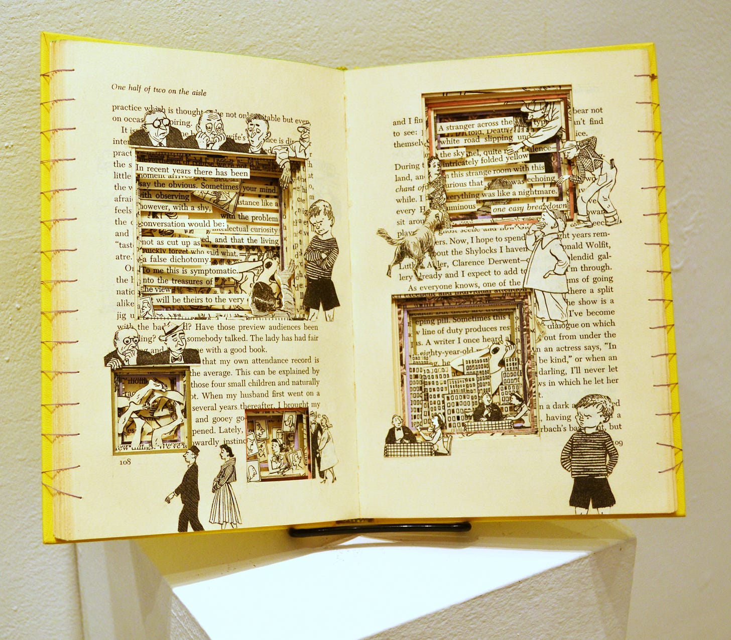
That certainly appears to be the case with “Please Don’t Eat the Daisies”, which was a popular collection of essays by Jean Kerr published in 1957. The book was about Kerr raising four boys in the suburbs, and it appears that Forcier has decorated the pages that the book is open with collaged illustrations from the book. The images are of mischievous-looking boys and somewhat alarmed adults. Forcier carved five square holes in the pages, filling them either with illustrations or sentences from the book.
“Toward the Morning” seems to be a novel of early frontier life by Hervey Allen. That said, the various interventions to the book that Forcier has made don’t in any way seem related to the book. Like all of her sculptures in this exhibit, the book has holes cut into it. The piece is covered by circular forms—many of them antique-seeming black-and-white photos and buttons. It is also sewn open to page 189. The photos don’t have any obvious relationship with the novel’s subject matter. I don’t know if we can say this work is “about” something, but I think whatever meaning it does have is unrelated to the book that it is made of.
Several of the objects in the show are assemblages by John Mark Sager. This Austin artist makes pieces out of various gathered odds and ends, often wooden or metal letters and numbers. This can be seen in his thin tower of objects “Best Wishes to the Whole Town”, which is composed of mostly of objects that have numbers and letters on them. The larger characters appear to have been decorative, but there are smaller bits that look like they were used for printing.
“Q Mountain” is a pile of objects with a big letter “Q” in the center. I can’t tell if the “Q” is a decorative item or if it was used for printing—I assume the former because if it were for printing, the "Q" would be reversed. The entire pile of objects is enclosed in a rectangular frame that seems to have once been a drawer. Because the drawer’s bottom has been removed and it is standing on end with the handle on the top, it resembles a carrying case. It is something like a sample case for a traveling salesman.
Aside from the use of letters, the various objects that Sagar combines in his assemblages don’t have any obvious connection. But in a way, that is what is appealing about assemblage. Our civilization churns out any number of manufactured objects whose usefulness expires, which become the raw materials for artists like Sager, Forcier and Sanders. Up until the 19th century, if you had a ceramic object, you kept it—often for generations—because there wasn’t a surplus. Then the industrial revolution changed that. Once we started manufacturing enough shit that we wanted to throw much of it away, it seems inevitable that artists would start reusing that refuse, finding beauty and meaning in trash.
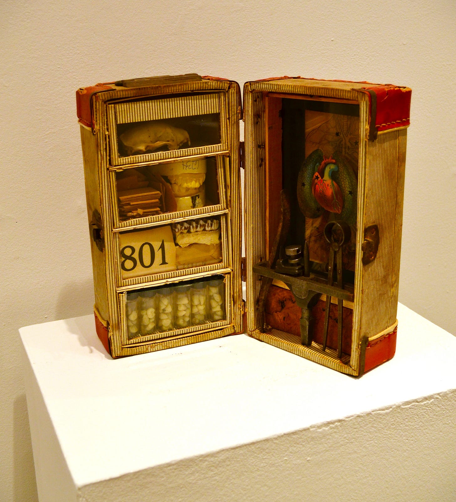
One of my favorite assemblagists is Ward Sanders, whose work I have loved for years. I have the confess here that I can’t be objective—I own two of Sanders’ assemblages. Like Joseph Cornell, many of his pieces are contained in a box that we, the viewer, look into. These boxes may be wood, but in this show at least one of them, “Replacements”, is contained in an old carrying case. It is filled with medical items and some tools. Sanders studied biology and taught it at John Marshall High School in San Antonio. His boxes often feel like research projects, as if he is examining objects for connections that only he can see. They also feel a little like the displays one might see at a high school science fair. But the individual elements are gnomic, without obvious connections to the other objects in each box. I wrote his asking a few questions, and part of his reply was, “What could be more absurd than collecting junk, trash, and throwaways just to organize and arrange the heap into boxes and cases as if they were ready for a journey?” This question could be asked of Forcier and Sagar as well, and of their forebearers like Joseph Cornell and Robert Rauschenberg.
Sometimes the title of the work that Sanders makes comes from an element in the work, as in “Evolution Made Plain”. In that regard, it is similar to the way that Forcier titles her assemblages. But the difference is that it seems that he uses the title of the element as a starting point of what to assemble. By combining the element with the words “Evolution Made Plain” with a bone, the subject of the artwork feels obvious.
But this in not always the case. What the title of “Ambassador” has to do with its disparate elements (several books, a rusted blowtorch, an ice pick, a billiard ball, etc.) is not clear. But Sanders clearly loves the look of our cast-off items, finding beauty in them.
I will close this with a personal story. The first time Sanders and I met, we ended up talking about books that we liked. We had similar tastes, and I asked him if he had read J.L. Borges. He hadn’t because he was intimidated by the volume of Borges work which he mistaken thought was very large. I pointed out that all of Borges short fictions fit into a single volume, and that he had a Borges-shaped hole in his life. A year or two later, he gave me a box he had created, titled “A Borges Shaped Hole.” I have been inordinately proud of that ever since.
[Please consider supporting this publication by becoming a patron, and you can also support it by patronizing our online store. And one more way to support this work is to buy books through The Great God Pan is Dead’s bookstore. ]


