I have been paying pretty close attention to Houston art galleries since 2009, when I started this blog. One quickly learns is that galleries are not really stable businesses on the whole. They pop into existence for a while, then shut down. In this regard, they seem a little like restaurants. Restaurants are appealing small businesses for would-be entrepreneurs, but not just any entrepreneur—specifically galleries and restaurants are started by enthusiasts. To be honest, I don’t know if there are any storefront-type businesses that have a high survival rate. Perhaps we just don’t notice it much with other kinds of businesses. When a restaurant or gallery you like shuts down, I notice it. Maybe less so with, say, dry cleaners.
But restaurants go under for purely business reasons—they don’t make enough money to keep paying rent, staff, and daily expenses. That happens with art galleries, but it is a different kind of business. Unlike a restaurant, galleries sell expensive luxury items. They don’t depend on lots of people coming in and buying their product every day. And a gallerist owns an asset that can be employed in a way that a restaurant can’t employ it—their client list.
Let’s say I have been running a gallery with modest success for several years—I will have developed a clientele whose names I have in a database (or a rolodex, if I am especially old-fashioned). I have a personal relationship with my clientele. Let’s say an artist X is pretty popular—her shows always attract collectors willing to pay many thousands to own her work. I, the gallerist, can be forgiven for wondering why I should keep paying rent on a storefront when I can personally sell work by artist X to her devoted collectors base (that I have spent years cultivating). Galleries thus have an option to close down their storefront and start acting as a sales agent for their artists. Their business can be run out of a storage space of some sort, which will cost much less than a storefront gallery. Over the years, several gallerists I know have evolved their practice in this way.
COVID has killed off a few storefront galleries. There was a time when Isabella Courts on Main was absolutely full of galleries, including some of my favorites. Now there are only two: Inman Gallery and Devin Borden Gallery. Each one that left Isabella Courts had its own reason for leaving. I liked it when that block of Main Street had big openings every six weeks or so—it was like a little art scene party.
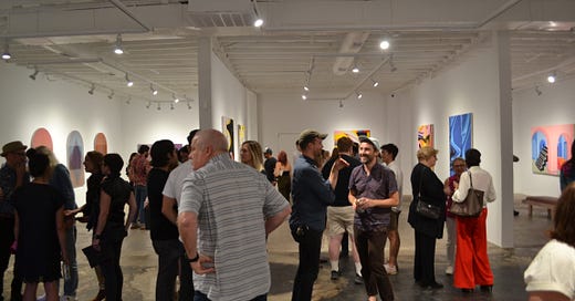
When a new gallery appears, I take notice. A few weeks ago, I visited Reeves Art + Design for their exhibit 5 Artists 5 Rooms. Reeves was that funky, cluttered antique shop at the intersection of Taft and Fairview. I’ve been by it several times over the years. My impression was that it was a cluttered, maze-like hive of interesting old furniture and knick-knacks.
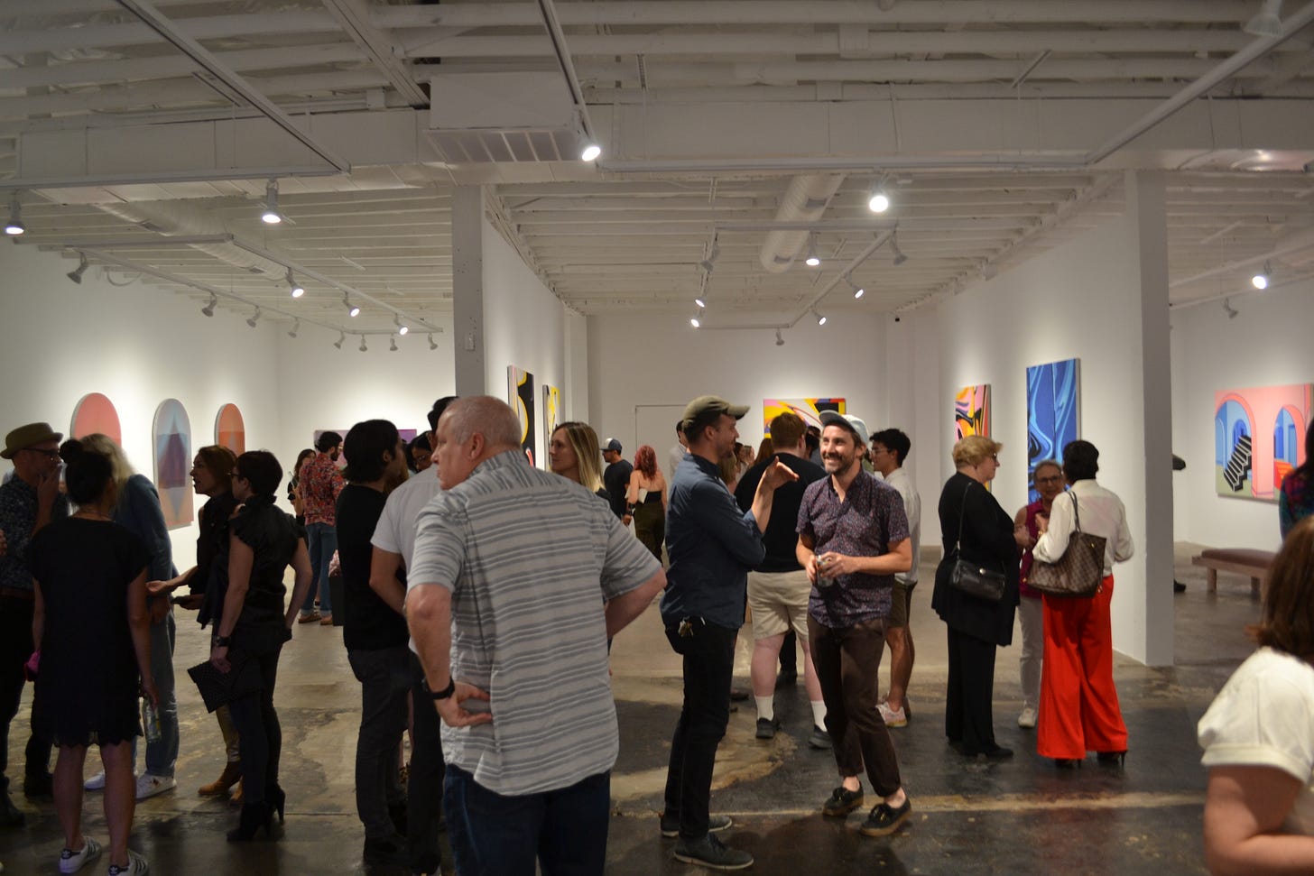
Reeves has completely changed its business and look. What was once a somewhat cramped antique store is now a gigantic white cube gallery. It’s now a good place to show big paintings, perfect for 5 Artists 5 Rooms. The artists are David Hardaker, Christopher Cascio, Emanuel Araujo, Max Kremer, and Terry Suprean. I’ve written about most of these artists at one point or another—I have been following some of them for more than 10 years.
All of these artists are primarily painters. This show allowed them all to show large works that would have seemed a little cramped in a smaller gallery. That’s part of what is so appealing about Reeves Art + Design—it is massive.
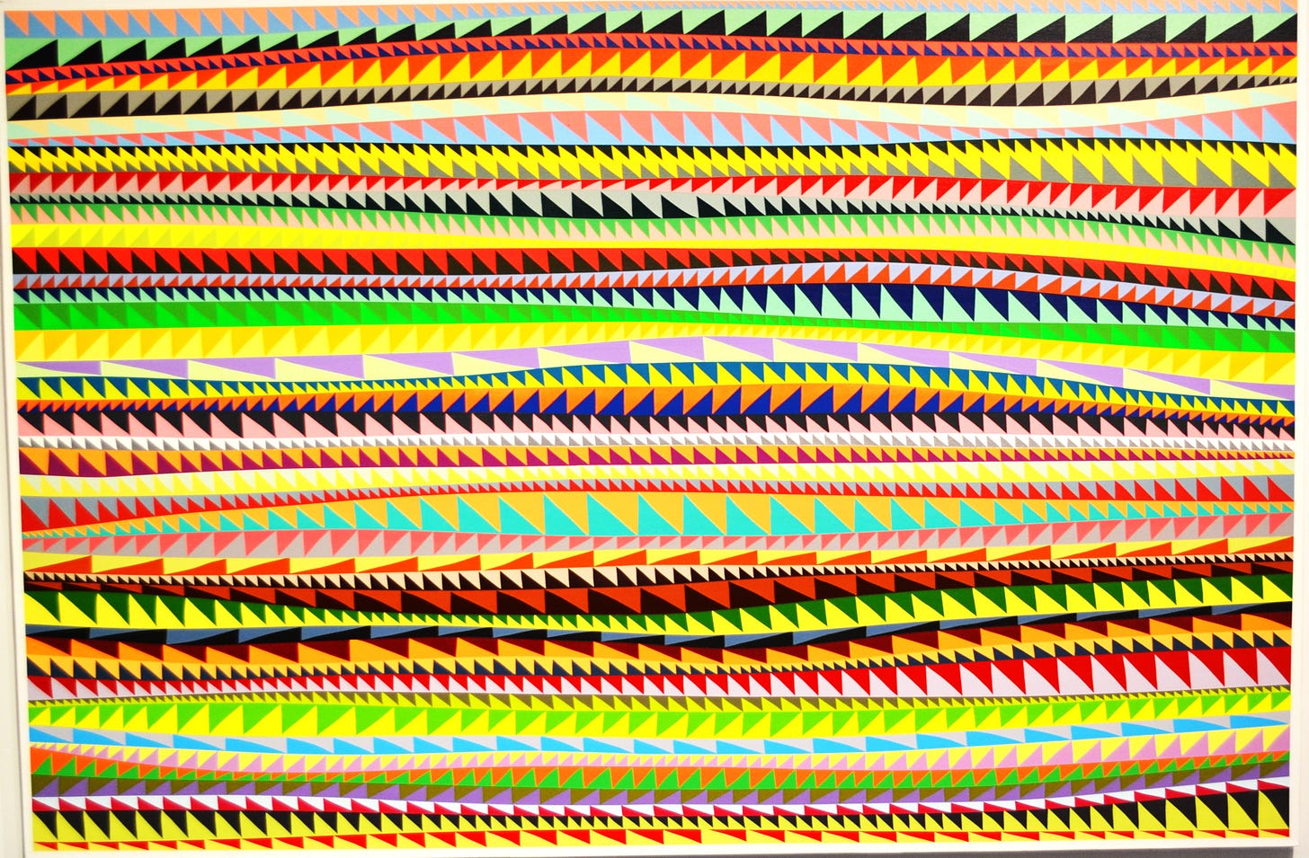
I have been following Chris Cascio’s art career since 2010. He was still a student getting his MFA at University of Houston. (And I should mention here that I bought a painting by Cascio out of his UH studio space.) When I first saw his work, he was reproducing magazine ads that one might find in 70s or 80s era music magazines. They felt particularly nostalgic for viewers of a certain age (my age, to be particular). He kept drawing on low-rent magazine ads, focusing on ads in porn mags and in magazines like High Times (he seemed to specialize in the economies of adolescent pleasures). He evolved into making collages out of wristbands that are given to patrons of nightclubs. The wristbands evolved into striped paintings (some of which are included in this exhibit).
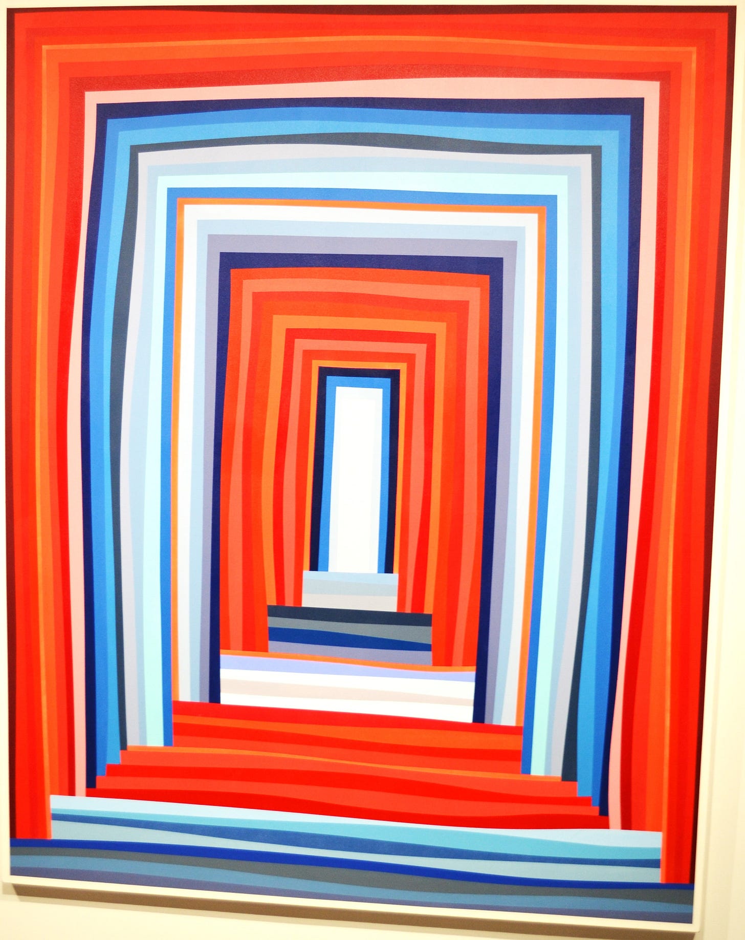
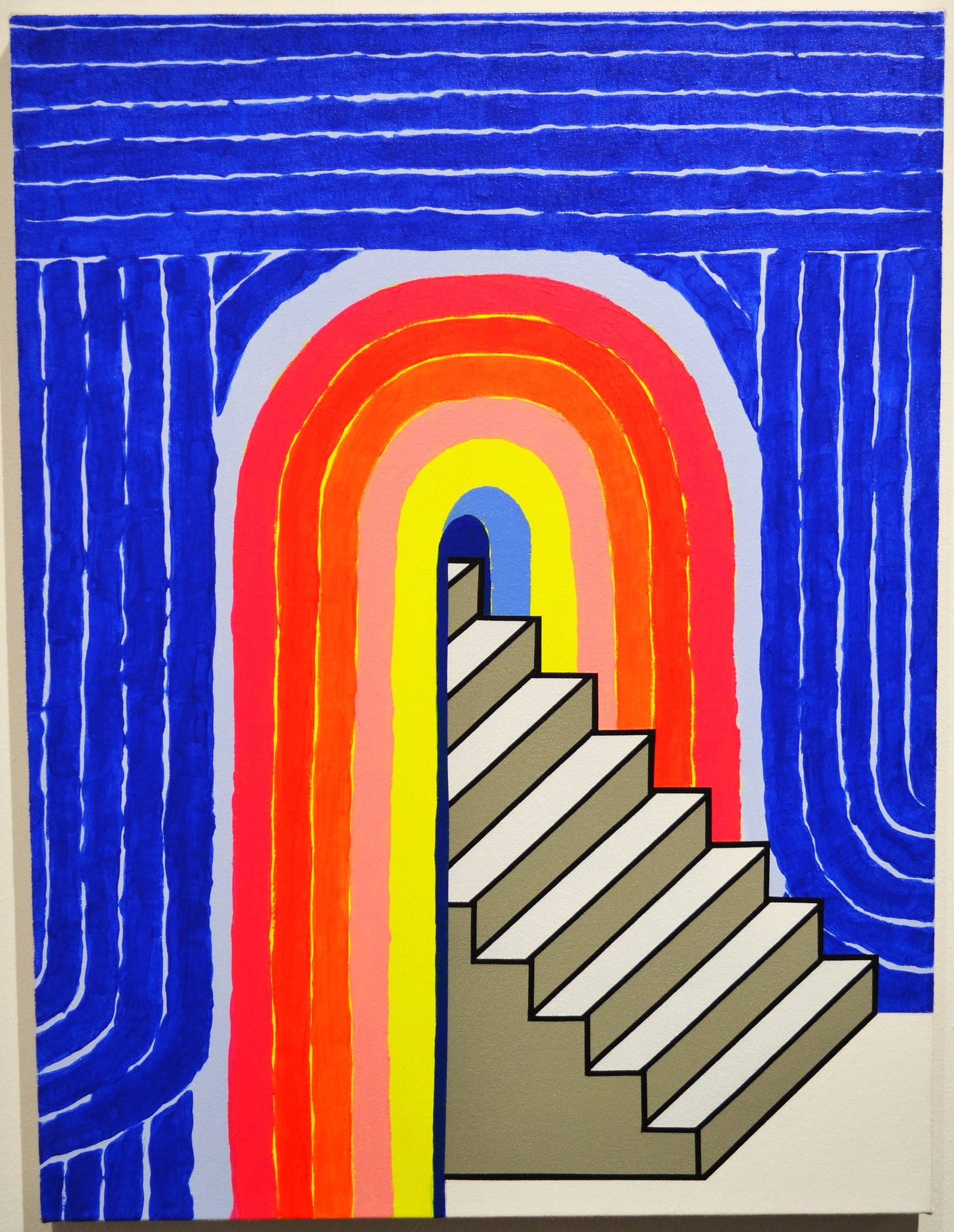
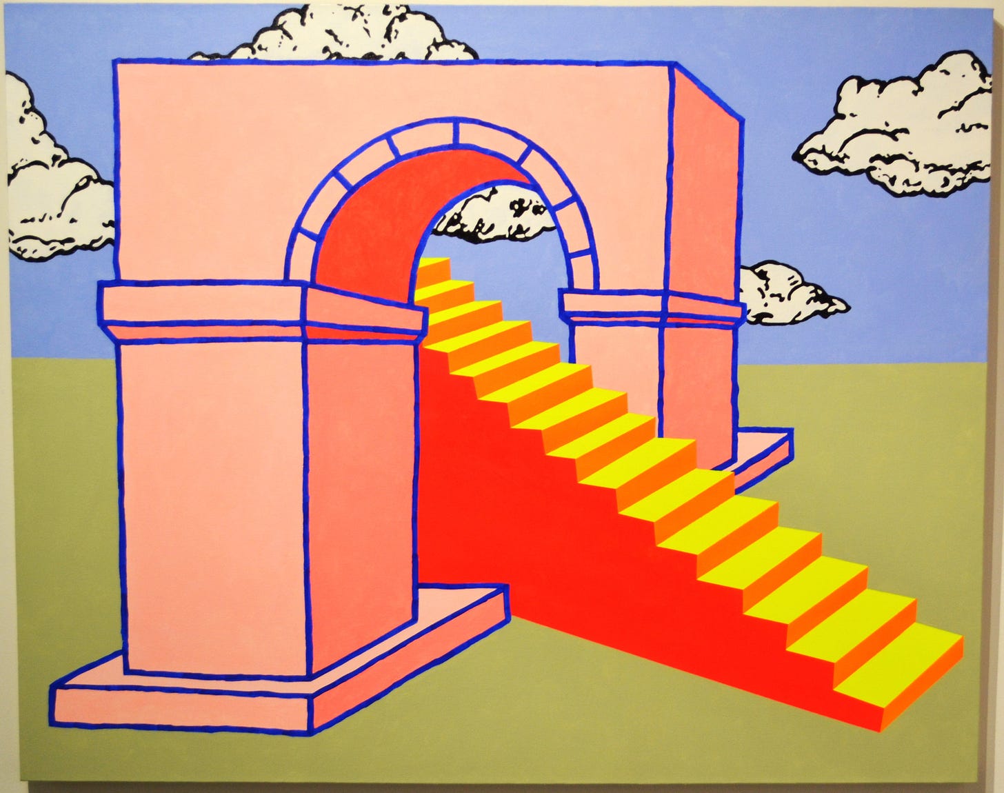
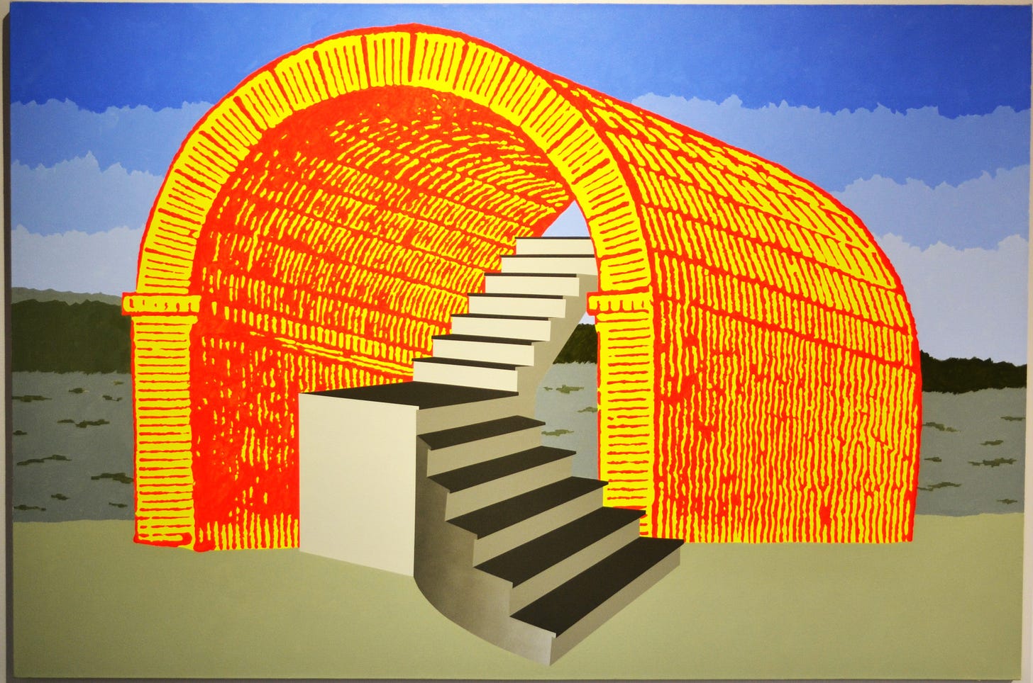
But his latest work is different. Cascio has created landscapes that play with perspective and logic. They are playful; they don’t try for realism or to fool the eye. Everything about them is dreamlike—not in the sense of appearing dreamy, but as when I am dreaming, everything I experience feels unreal and illogical, but I simply accept it.
Untitled (After Kleberg) caught my eye not because it reminded me of Matt Kleberg’s art (which it certainly does). I had never heard of Matt Kleberg until I wrote this review. But what drew my attention was the striped structure surrounding the staircase at the center. The hand-drawn lines if the stripes made me think of Frank Stella’s early paintings. Those paintings were renowned for their intense flatness—critic Leo Steinberg referred to the flatness of Stella and similar painters as the “Flatbed picture plane”. For me, the combination of Stella-esque stripes and an aggressively isometric staircase playfully contrasts the flatbed and the illusion of three dimensions.
I’ve also been looking at Emmanuel Araujo’s art for years. When I first encountered his work, he went by the name Brandon Araujo. I was uncertain if this was the same artist when I saw the exhibit because of this name change and also because his new paintings seem distinct from the work I’ve seen before from him. I actually thought this might be work by Brandon’s brother or some other relative. But I asked and he told me it was him. Why he changed his name, I don’t know. But I wanted to point it out in case readers have encountered Brandon Araujo’s paintings in the past.
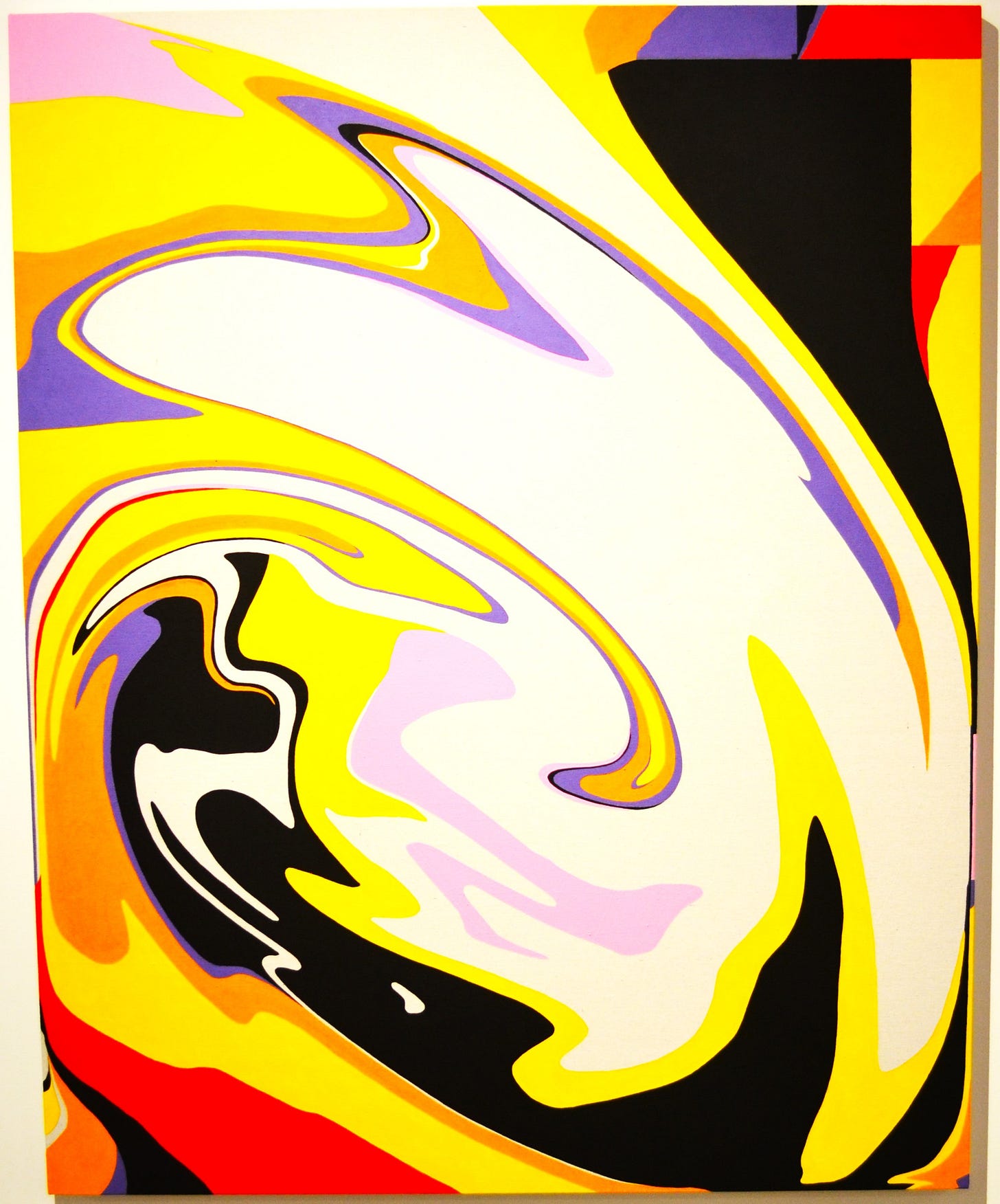
If you look at Araujo’s older work, it will strike one as more casual, less precise than the work in this show. His work has always been mostly abstract, and that continues in this exhibit. But while the older work feels a little more Rothko, this work is a little more Kandinsky. His new paintings are more swirly and active, but are hard-edge abstractions.
Interestingly, despite their hard-edge painted edges, what he paints look like swirling liquid pant. Telepathy and Ecstasy appears to depict liquid pigment swirling down a drain.
It reminds me a little of Roy Lichtenstein’s series of Brushstroke paintings from the ‘60s. Lichtenstein was parodying abstract expressionism. Araujo seems to be parodying Araujo: he is asking himself, what if I dispensed with my Clyfford Still-like brushstrokes and thick impasto and depicted more-or-less the same thing with smooth, clean acrylic paint.
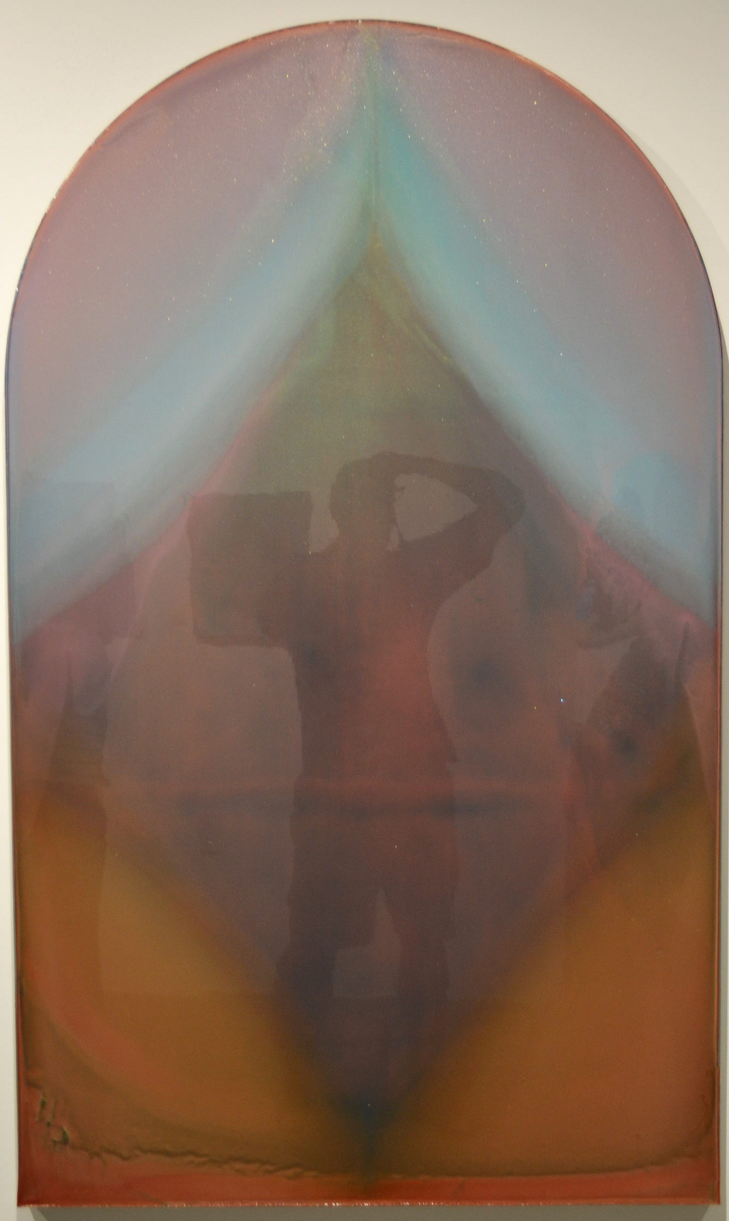
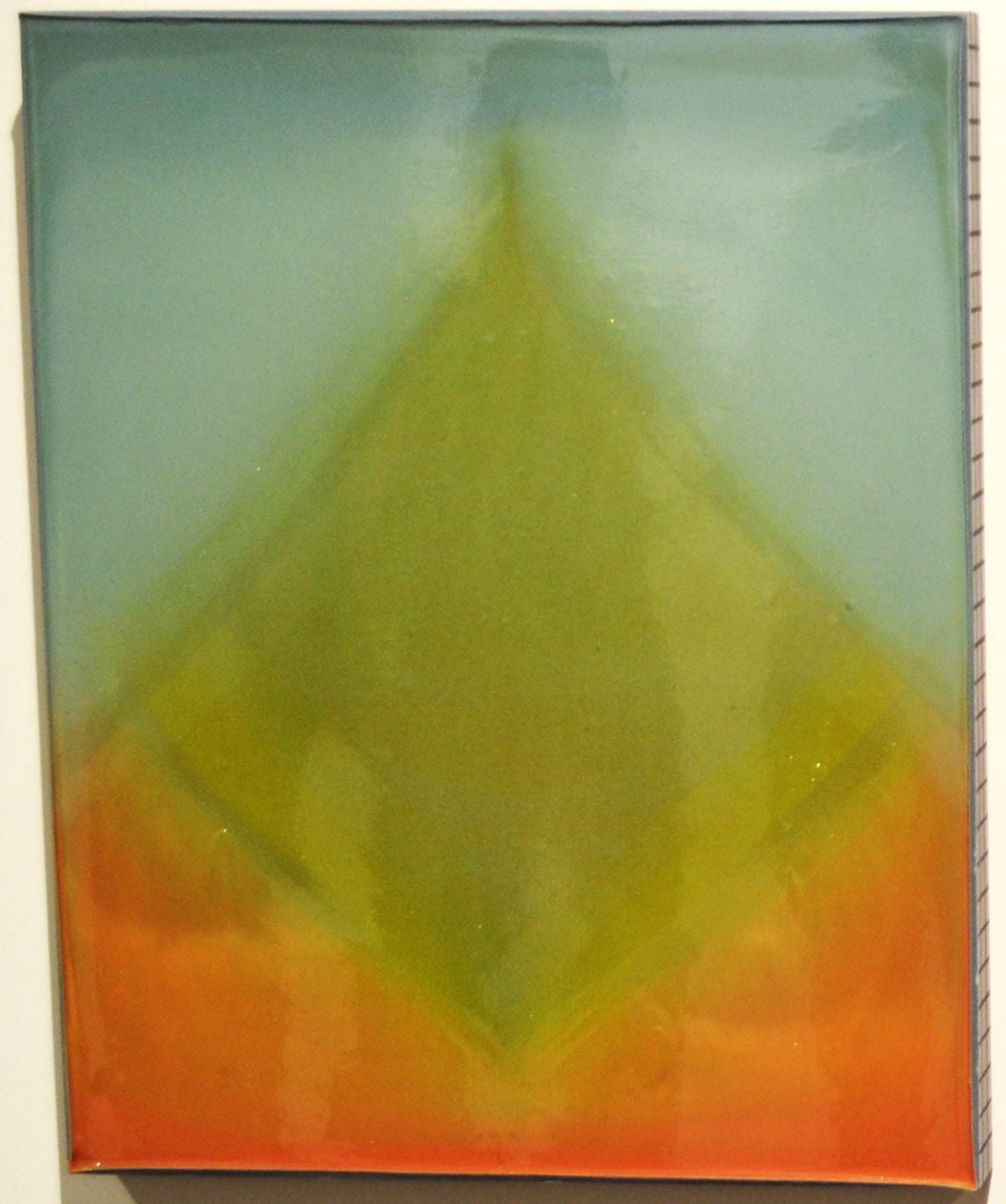
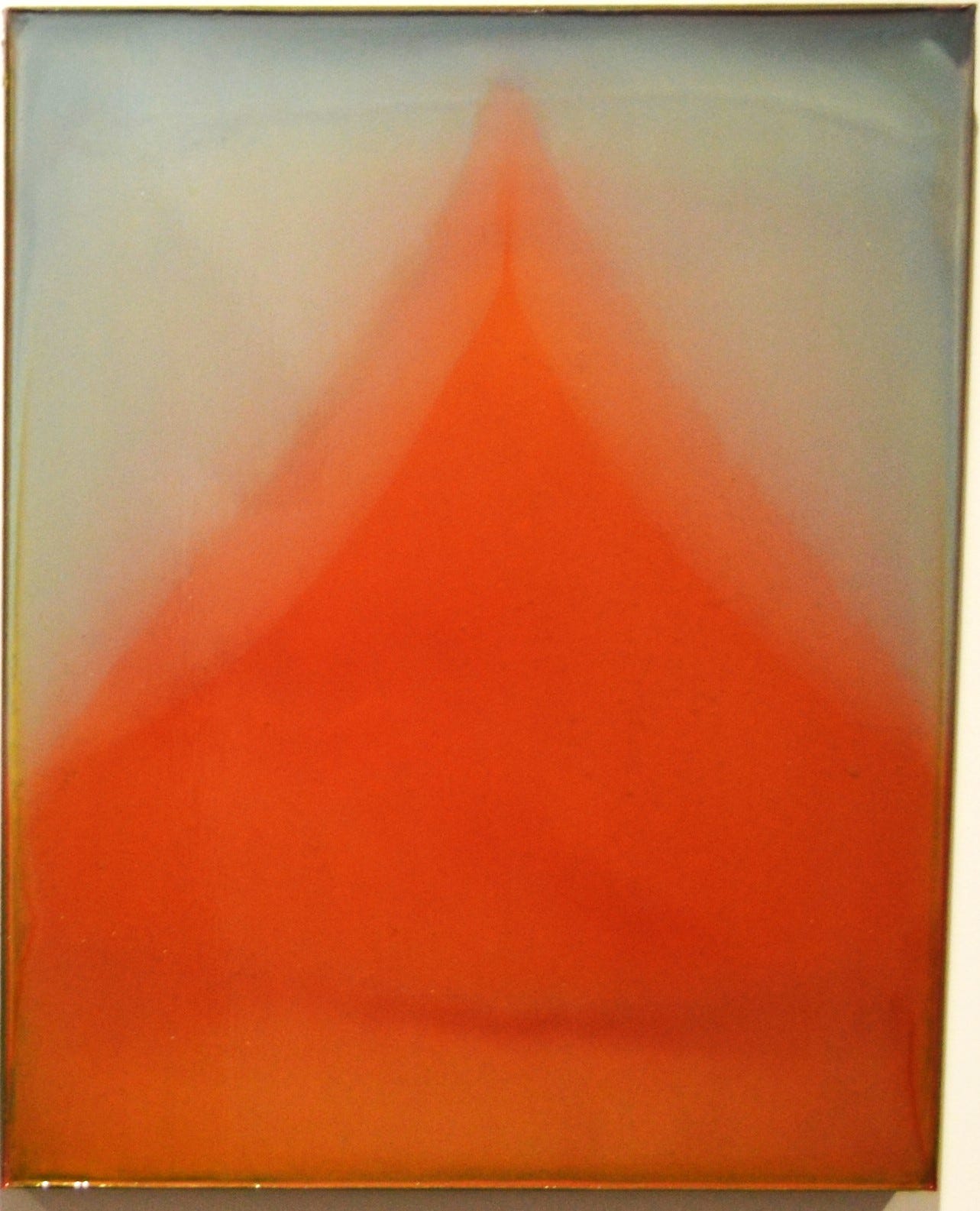
Terry Suprean is another artist whose work I followed a long time. I first saw his work when he had a solo exhibit at the Temporary Space (a long-defunct gallery that was a project of UH MFA student Keijiro Suzuki). (I wish I could link to that early Suprean review, but it was published in a now-defunct Houston Chronicle publication called 29-95.) Like Cascio and Araujo, his work has evolved a lot in the past twelve years. Suprean has moved towards a Mark Rothko-esque sublime, with layers of transparent pigment that Suprean makes for himself. The works look as if they were coated with clear veneer of some sort—you can see my reflection in the surface of 7.24.22-8.18.22.
These works are abstract and one can imagine them as curtains or veils opening, revealing infinity.
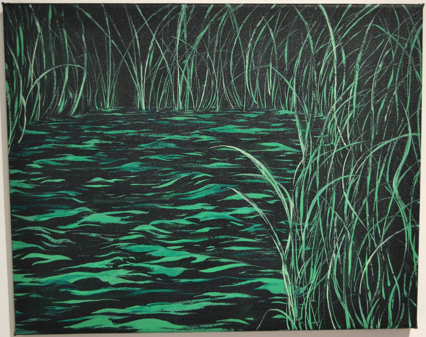
Max Kremer is much younger than the other artists in the exhibit. His father is also an artist, Paul Kremer. Kremer’s work, like that of his father, uses a severely restricted palette for each painting, And like Paul Kremer, Max’s paintings are landscapes but for less abstract than Paul’s. While a painting like Basin is more-or-less realistic, it doesn’t appear to be a real place. I see it as a spooky made-up location, remote and possibly dangerous. If this is what you are witnessing, well, you had better hope there is a nice warm ski lodge behind you.
Marsh feels a little more benign, but it is still devoid of humanity. Both paintings seem to employ one color each (a dark blue for Basin and a similarly dark green for Marsh) and white paint.
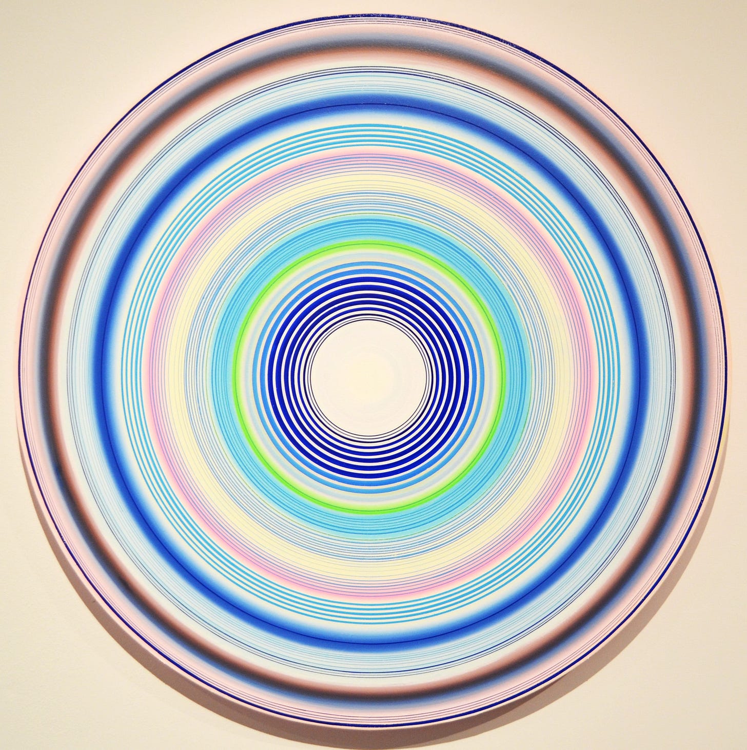
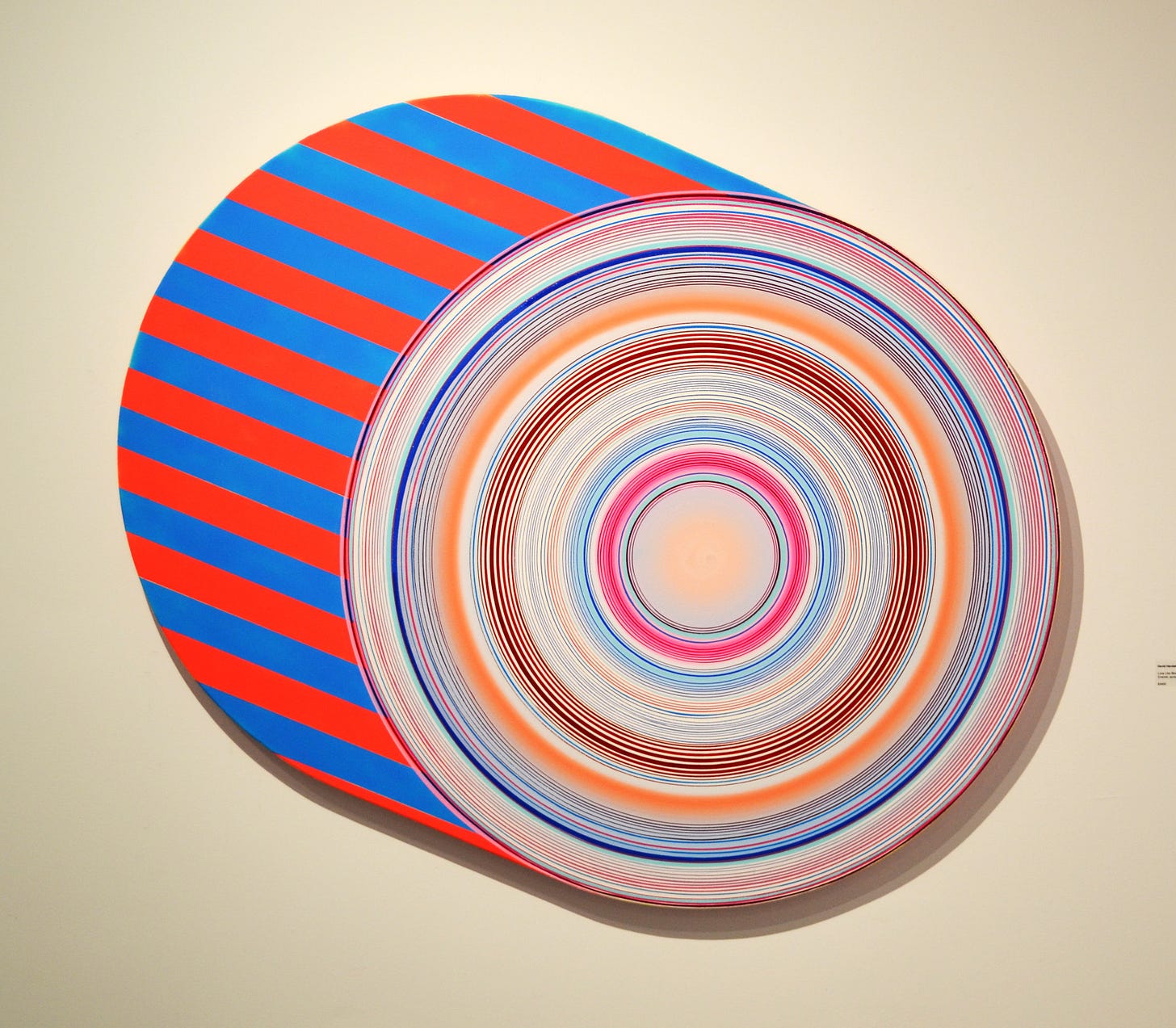
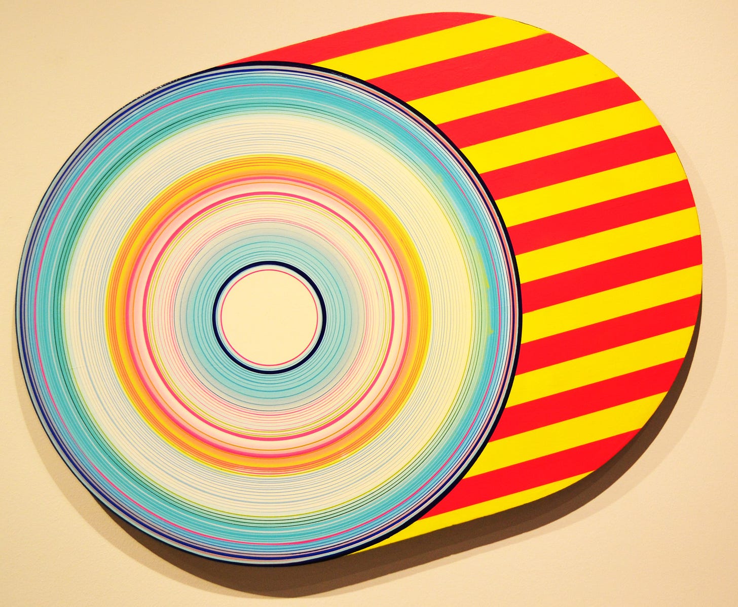
David Hardaker is an artist who ran a very nice gallery, Avis Frank in Galveston and later in Houston that I visited many times over the years during its existence. Hardaker is someone whose taste I respect as a gallerist, and who is also a skilled painter. His work when I first encountered it seemed related to pop art. He used printed images as the basis for many of his paintings back in the day.
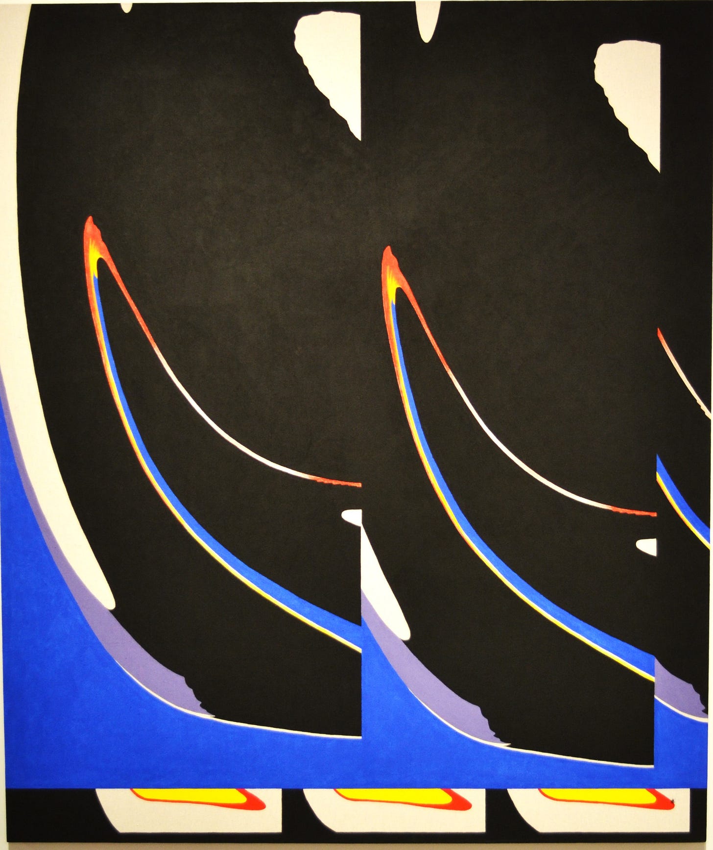
But his new work is very geometric. Hardaker has gotten out his compass and straight-edge for this series of circular and isometric conical paintings. It is interesting to me that this exhibit features artists who have evolved tremendously in their styles of work (excluding Max Kremer, who is so young). In each case, I have followed the artists’ work since they were much younger. It has been a privilege to see them evolve and grow.
The show closes today, so if you haven’t seen it, you had better hurry!
.[Please consider supporting this publication by becoming a patron, and you can also support it by patronizing our online store. And one more way to support this work is to buy books through The Great God Pan is Dead’s bookstore. ]




I really enjoyed this read!
It's good to see this. It's hard to keep a gallery going over the long term. I was just talking about Reeves the other day with some mutual friends. Looking at Hardaker's work makes me wonder if he secures the canvas on a potter's wheel and spins the thing.