The Big Show part 2
This post takes up where I left off a few days ago in The Big Show part 1.
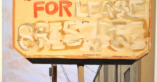
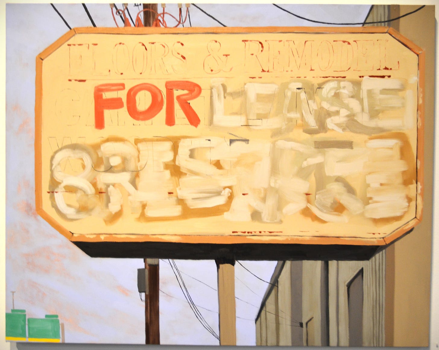
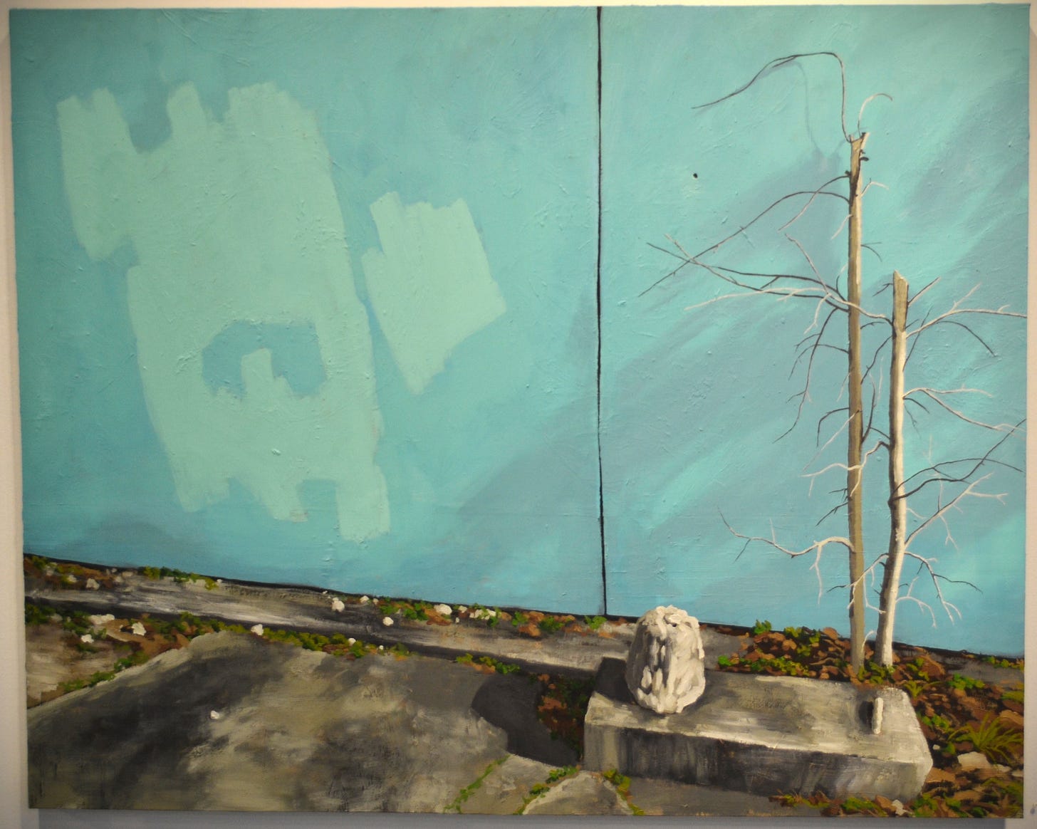
Some other pieces in the exhibit seemed to tread more traditional artistic ground. They are naturalistic depictions of the world, highly polished. Charis Ammon’s work seems to mainly consist of realistic depictions of banal urban scenes. Both of Ammon’s pieces depict things covered up—an old sign that has been erased, Erasure, and a wall on which something—presumably graffiti—has been painted over. I’ve always found these anti-graffiti measures futile and unintentionally beautiful—they cover up graffiti without leaving a blank wall in its place. Instead, the wall becomes a subtle abstract painting. That is what Ammon depicts in Shush!
Charles VanMeter is a printmaker who has three rural scenes in the Big Show. I haven’t found anything about VanMeter online. But it is interesting that three such traditional, even sentimental images are included in the exhibit. It gives this year’s Big Show an even more inclusive feel than it has had in the past. Of course, it would mean a thing if they weren’t also quite appealing. Ft. Myers is a Florida landscape (palm trees are visible in the distance). It’s not a wild landscape—we see a fence running through it. But there are no people or animals depicted—just trees, grass, a fence lines and clouds. It is a lithograph, but there are no grey-tones. Frog is a similarly bucolic scene, but is focused on a house in the center of the composition. It appears to be at twilight—the house has a light on in front and is loomed over by tall dark trees.
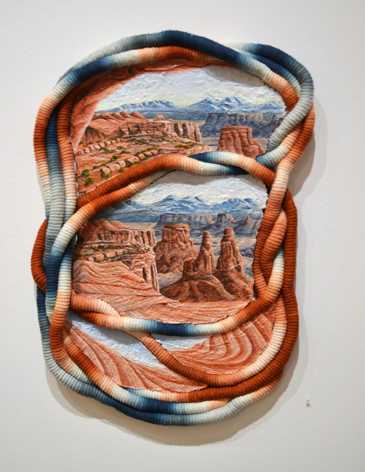
There is another landscape on the same wall as VanMeter’s prints by Demi Mixon called Sandy Portal. There are actually four portals in this work. The portals are formed with tubes made if cotton fabric, and within each portal is a view of a desert landscape. The cotton fabric tubes in essence form four frames around four images. The tubes are various shades of blue and tan—sky and sand. They aren’t right angles; while the shape of the piece as a whole is somewhat rectangular, it has a rounded structure. The paintings of desert scenes in the portals match the cotton threads in color.
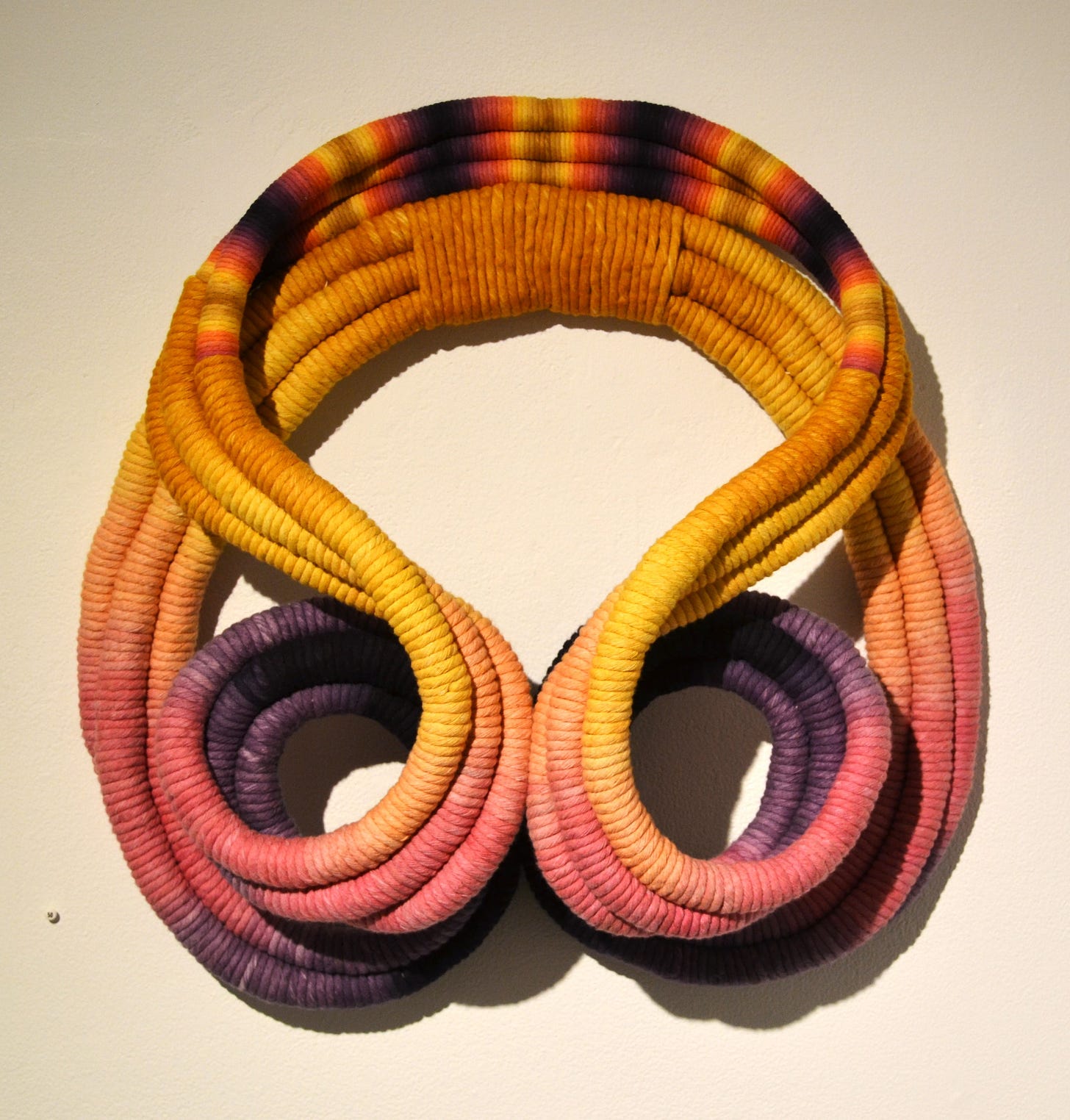
At the top of the stairs to the mezzanine gallery is another piece by Mixon. Mantle consists solely of cotton fabric rolled into tubes. There is no painted element here. Even more than Sandy Portal, this piece is made of curves. It is basically symmetrical, reminding me of arabesque tile work. The colors are purple, pink, orange, yellow, and brown. Because it is made of cotton wrapped around wire tubes, it projects slightly from the wall, giving it a minor sculptural presence in the viewer’s space.
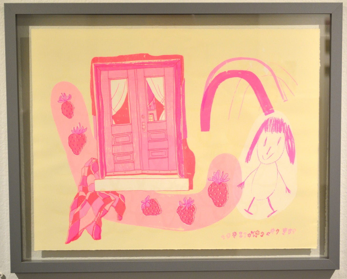
Other pieces in the show seem even more eccentric. Chelsea Clarke has three very pink screenprints. Clarke is a resident artist at Lawndale. Her three prints feature shades of pink ink on yellow paper. I DON’T WANT ANYTHING/I miss you has a brown ink layer as well. The pieces have a childlike feel. Home Askew, with its stick figure and strawberries, feels particularly childlike. The other two pieces, . I DON’T WANT ANYTHING/I miss you and This Too, are more abstract but feature text one them. All three are the same size and like many others in the exhibit, form an coherent triad. It looks like Clarke used the same ink in all three prints.
Another piece that had a somewhat child-like vibe was Sumin Hwang’s large floor-based video/sculpture “you move, you are being moved, you are movement!” Hwang is an undergraduate at Rice University (which makes me proud because I am an alumnus). Her piece consists of a amorphous pile of multicolored stuffed objects, perhaps representing a creature—it has a goofy, cartoon smile and a hand reaching our from the pile. In its “belly” is a small video monitor, showing a strange video of a similar creature walking on a beach. (There may be more to the video, but I didn’t sit and watch its entire 35 minutes.) Because the video is not too high up off the ground and recessed into the bulbous layers of the creature, there is a stool in front of the sculpture to help the viewer sit and watch this perplexing thing. Like Lindy Chambers, Hwang has created a curious non-human creature and plopped it down among us.


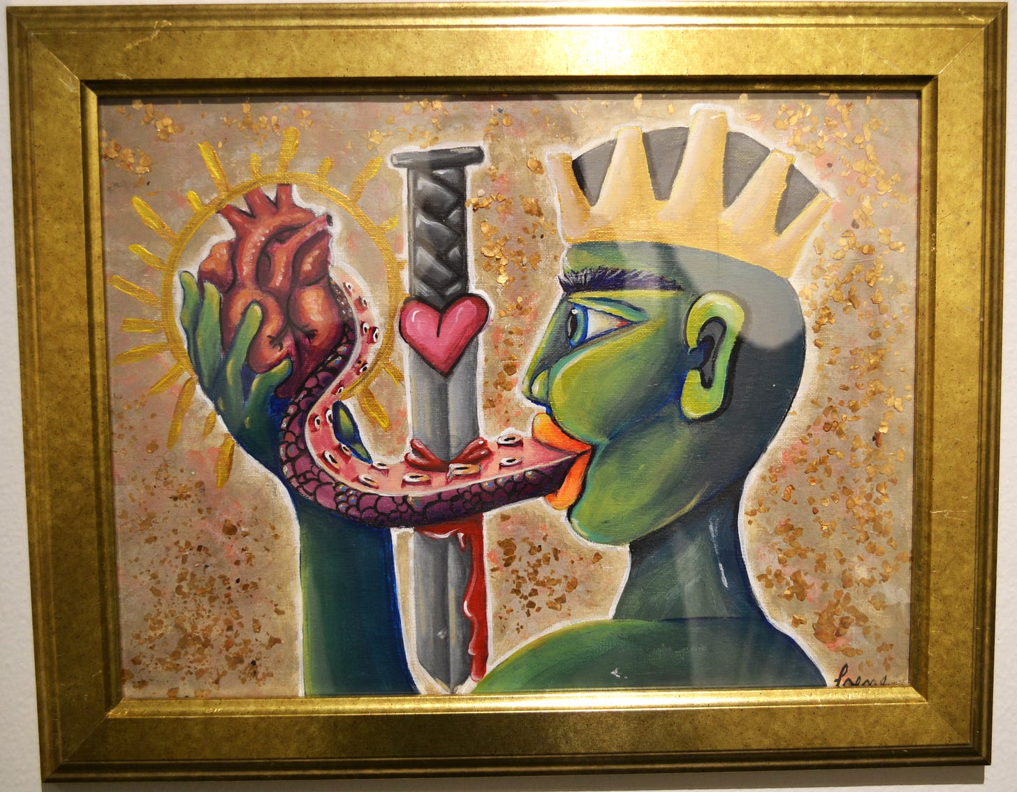
Let me swing back to a more traditional kind of art—paint on canvas. Specifically, acrylic and mica on canvas paper. A Dream #1 by Irene Valentin, however, is one of the eccentric pieces. It depicts a head and shoulders in profile. The figure in it is wearing crown, so it is a king or queen. It is green and it has a long tongue that looks like a octopus tentacle. A downward facing sword stabs through the tentacle, and it’s tip is wrapped around a heart. The heart is held by the monarch’s hand. It appears to be examining the heart with taste, touch, and sight. What this surreal tableaux might signify, I can’t begin to guess. But it is memorable.
Another eccentric, memorable piece is AQVI SE CONTIENE UNA DISPVTA by Paula Córdova. This sculptural object is made of urethane resin, EVA glue and dried pig's blood. It appears to be a depiction of a bag or container made of semi-transparent resin, resting on a square platform covered with dirt (the “dirt” must be the dried pig’s blood). The “bag” has writing on it in Spanish, starting with the words of the title, meaning “A dispute is contained here.” I can’t read the rest of it very well. It seems to discuss Indians (“Indios”) and the Emperor (“del Emperador”). With the quasi-latinate title, it feels as if it is meant to be historical. With its mentions of “Indios”, it is perhaps referring to colonial Mexico. What the dispute is, I can’t tell. It looks unpleasant, whatever it is.
Finally, two pieces that edgedover towards conceptual art. Julia Rossel’s Natural Bond has a grungy feel. Assemblage was once described by Karen Archey as “combining crap with crap”. All the materials are pieces of junk and discarded objects, and they don’t try to hide their modest origins. But when combined in just a certain way by an artist, that’s where the magic happens. In Natural Bond, the crap it is made from is a flag-sized piece of polyester with brown and yellow dye blown onto it, lace, wire, and rocks stolen from train tracks. The flag-shaped cloth is drooping because it is weighed down by a rock. One thing I like about Natural Bond is how unassuming it is. It’s the kind of thing that if you walked by it out in the world, you might not identify it as a piece of art. It absolutely requires being in a place like Lawndale for its identity. Rossel is a student getting a BFA from the University of Houston, and works as a studio assistant for Meredith Jack.


The other conceptual piece I wish to mention and close this review with is Bicimaquina #1 by Saúl Hernández-Vargas. It is part of his máquinas de visión series. It is a machine with no function, which recalls Bicycle Wheel by Marcel Duchamp. The tradition of absurd, useless machines as art goes back over a hundred year at this point. His work seems to draw from that dada tradition. As a vehicle, Bicimaquina #1 is going nowhere fast. Like Bicycle Wheel, its only use is to provide pleasure. A kind of idle, bored pleasure. No one would experience Stendhal Syndrome in front of an artwork like this, but they might be amused to spin the unconnected gear and pedals. Because, why not?

There are other interested artworks in this year’s Big Show, but this all the pieces I want to write about now. See the exhibit—It’s up until August 15.

